TABLE OF CONTENTS
- Chapter1: Introduction
- Chapter 2: Calendar
- Chapter 3: Artists
- Chapter 4: Contacts
- Chapter 5: Studio
- Chapter 6: Communications
- Chapter 7: Website
- Chapter 8: Editing Text
- Chapter 9: Media
- Chapter 10: Links & Anchors
- Chapter 11: Admin
Chapter1: Introduction
Welcome to LOOKBOOKSpro
LOOKBOOKSpro is a groundbreaking proprietary software platform, which seamlessly incorporates digital marketing tools, sales management and portfolio management.
Powerful easy to use tools let you create professionally designed Web Pages; compile portfolios; organize contact information for targeted marketing campaigns; track industry response to launched campaigns; publish your images to your social media accounts (twitter and Facebook) and generate new traffic back to your website. LOOKBOOKSpro streamlines this well-rounded approach to marketing to maximize ease, efficiency and effectiveness.
LOOKBOOKSpro is masterminded and supported by LOOKBOOKS Media, Inc., an innovative technology company that provides integrated digital marketing solutions to the world’s leading fashion, beauty, photography, design and fine art clients.
Log In
To log into LOOKBOOKSpro you can use a screen name or email address along with your password. If you forget your password, click Forgot Your Password. Enter your email address into the address field and instructions and a link to reset your password will be sent to you.
Navigation Bars
Navigate through LOOKBOOKSpro, using the two horizontal navigation bars at the top of the page. The main navigation bar provides access to the different program pages, while the secondary navigation bar provides access to Support, Logout and Admin.
Main Navigation Bar
The main navigation bar is shown in the figure below. To open a page, click on the name of the page you wish to access. The page will be highlighted once selected. Each page will be covered in detail throughout this guide.

CALENDAR
The Calendar page allows you to enter Options to a calendar date or dates for a job. You can associate artists, contacts and companies and track the job related costs as rates, fees and expenses. The tools in Calendar allow you to generate estimates and invoices with terms and conditions of service.
ARTISTS
The Artists window houses tools for creating, organizing, storing and viewing artist profiles, complete with contact information, biography, cover image, portfolios and additional notes.
CONTACTS
In the Contacts pages you can compile lists of contacts with their contact information. Contacts are organized alphabetically, by company and in groups (i.e. the type of work they do). This cross-organizational structure maximizes search capability and ease and efficiency for launching targeted marketing campaigns.
STUDIO
Powerful, easy to use tools in Studio can be used to you develop a media library of unassigned assets (photos, videos etc. for general use), design client portfolios, launch marketing campaigns, publish images to your social media accounts and drive traffic back to your website.
COMMUNICATIONS
The Communication page works seamlessly with the Studio and Contacts pages. Graphic and numeric tracking systems in Campaigns and Newsletters track the response to your marketing campaign or newsletter mail-out (i.e. the number of emails that have been opened or bounced, the number of clicks on pages and unsubscribed rates). A campaign-cloning feature and a newsletter template feature increases ease and efficiency for selecting portfolios for email marketing initiatives, compiling contact lists and composing custom messages and newsletter mail-outs.
Use the tools in Newsletters to design professional quality templates. Templates are files, which control how content is displayed in email marketing campaigns or on your website. Template tools can be used to position and style text, graphics, tables, charts, headers, footers, sidebars, links etc. Templates help you balance uniqueness and flexibility with consistency and efficiency.
WEBSITE
The Websites page combines tools to create News posts and publish and maintain static pages. In News you can publish professional quality news posts to your website. News posts are generally small chunks of information that are updated frequently. News posts can be categorized and tagged so they appear on multiple website pages.
Some information that you want to display on your website rarely changes (is static) and is pertinent to one page only. Use pages to design and publish, static documents to your website.
DASHBOARD
Secondary Navigation Bar

Welcome username
Once a user has logged into LOOKBOOKSpro the Admin and Logout commands appear as selections from the Welcome link

Admin
To protect the quality and stability of the information entered into the program; a number of tools in LOOKBOOKSpro are accessible only through administration. Where it is necessary, these areas may be password protected and accessible only to authorized personnel.
Logout
It is important to log out of LOOKBOOKSpro before leaving your computer, especially if there is any chance that other people may have access to your computer. If you close your browser or tab without logging out, you will continue to be logged in.
Help
A link for Help provides links to open a Support ticket and to open the FAQ Knowledge Base

Support
The Support link opens a new ticket form where a user can submit a question or request to LOOKBOOKSpro.
FAQ
The FAQ link opens the Solutions Home where the user can search for solutions or to find answers to the questions they submitted in tickets. It contains a searchable knowledge base, an FAQ section with answers in text or instructional videos, links to public Forums and new create support tickets.
LBProAccount
The LbProAccount link allows the user to open the account from the list of available accounts for this user.

Sidebar Navigation Tools
Each page in LOOKBOOKSpro has a set of sidebar navigation tools, which will be discussed in chapters dealing with their respective pages.
Website Basics
There are a few fundamentals of website design that you need to understand before you select which page to use to publish content to your website. Visitors come to your website to view information on a number of pages. Some of the pages on your website are designed similar to how you would design a page for print. Design elements are carefully selected and the contents are arranged and published on your website as a complete page. However, when information is constantly being updated and/or needs to be published to multiple pages on your website, using a magazine style approach can be quite inefficient.
Static and Dynamic Pages
Two important questions to answer when you are deciding where to publish content on your website are:
Is the information static (rarely changes) or dynamic (changes frequently)?
Do I want to display the information on one page or multiple pages?
Static information that you want to display on one page can be placed on pages that are created similar to pages in a magazine. An entire page, with all the text and graphics is carefully laid out and published as a single document. In LOOKBOOKSpro static pages are created in Pages.
Static pages are created as a single unit, chunks of information cannot be separated from them to be used on other pages. While static information can be tagged in LOOKBOOKSpro, it cannot be categorized.
Dynamic pages, on the other hand, are composed of information that is constantly changing. It would be impractical to create a new page manually every time you want to add a new news item to a page. Dynamic pages are composed of chunks of information that have been categorized and tagged so they can be assembled to appear on multiple pages on your website, in response to the click of a button. These chunks of information are frequently called news or posts. Dynamic information is published using the tools in the News page in LOOKBOOKSpro.
Categories and Tags
Categories are general headings you use to group or order chunks of information for your website (i.e. Men’s Fashion, Ladies’ Fashion). They are used in News to identify the type of information found in a news post so that the news item will appear on the proper pages of your website.
Categories are also used in Studio to organize artists according to the type of work they do (i.e. Photographer, Fashion Designer, Fashion Illustrator). There is no overlap between the way categories are used in News and the way they are used in Studio.
Tags are specific words or short phrases (i.e. suits, sleepwear, new arrivals, etc.) used to organize different types of content. In the News page, a chunk of information (image and/or text) categorized as Men’s Fashion and Sale and tagged as Suits and New Arrivals can be assembled on four different pages when a visitor clicks on the pertinent text link (i.e. Men’s Fashion, Sale, Suits or New Arrivals). In addition to using tags to organize news Items, tags are used to organize media (images, videos), portfolios, and campaigns. In these latter instances tags are used to enhance search efficiency.
To add a tag:
• Type a descriptive word or phrase into the text field. When you begin to type, a pop-up window will display similar tags that have used previously. You can click these tags to enter them in the tag field.
• Press the enter/return key after each tag is entered (do not use commas to separate tags). As you can see in figure below each tag is entered separately into its own text field. Click the x if you want to discard the tag.
• Click Save before you close the dialogue box. If the save button is hidden by the ‘Type to add custom tags’ box, click anywhere in the dialogue box and it will reappear.

Warning About Save
We all know that if we do not click save all the information we place on a page is usually lost. There are several reasons people might forget to click save in a website design program:
1. The Save button is frequently located at the bottom of the Page you are working on and often you must scroll down to find it, making it easy to forget.
2. You frequently work with dialogue boxes that have a save button at the bottom. The save button in a dialogue box saves the steps carried out in the dialogue box but it usually does not save the final product on your documents. Make it a habit to click save on your document, regardless of how many times you have clicked it on a dialogue box.
Chapter 2: Calendar
The Calendar page displays a calendar where you can create options with the job details. Clients, artists and contacts and the associated costs involved with a job by way of rates, fees and expenses can be entered. From an option you can create and submit estimates and invoices and track financial information.
In this chapter you will learn to use the tools to add and manage options:
Create New Option
Quick Create Contact
Quick Create Company
Edit Option
Add Rates and Fees
Add Expenses
Add Notes
Create Estimates and Invoices
Calendar Navigation
When opening the Calendar page the default view is of the details of the last option that was open. To close the current option click the “x” button on the far right of the option menu.
Month, Week, Day View
The Calendar view of the current Month is displayed and the calendar will show the current options that are scheduled for the month and with any filters that have been applied. The calendar can be narrowed to view by Week or by Day by clicking on that option from the Calendar navigation bar.

List View
The Calendar page can also be viewed as a list by clicking List from the Calendar navigation. Clicking List also enables a date range picker. Click on the field with the date range to open two date pickers. Choosing a date from the left picker selects a start date and choosing from the right date picker selects an end date for the range. Clicking Apply filters the list of options found within that date range.
Next and Previous Month
The Calendar navigation includes a left “<” and right “>” arrow button that will change the calendar to the previous (left arrow) or next (right arrow) month in the current calendar year. To return to the current month click Today from the Calendar navigation, with today’s date selected.
Filter Options
The Options displayed from Calendar can be filtered in one of two ways from the left sidebar. The Options can be filtered by ArJsts or by the Status of the option.
Filter by option status
To filter Options by status, click on one or more of the color coded circles from the sidebar under the Status heading. The Calendar will be refreshed to show only those Options that are of the statuses selected.

Filter by artists
To filter Options by status, click on one or more of the color coded circles from the sidebar under the Status heading. The Calendar will be refreshed to show only those Options that are of the statuses selected.

Filter by favorite artists
The Options can be filtered by Favorite Artists that you have added from your Booking Settings. To add artists to a list of favorites click Booking Settings from the bottom on the sidebar and choose Manage Favorites. The Artist Browser pop-up will open where you may browse the artists by type and click the artist name to add them to the Selected Favorites column.
By checking one or more names from the Favorite Artists in the sidebar the options will be filtered by the artist of your choice.

Search
The Search field will allow you to search for an Option by the Job Name and open that job for changes. By typing a job name or partial job name into the Search field a list of matching job names will appear. By clicking on a single job name, that Option will open in split-view, with the Calendar displayed in the top pane and the OpJon details are displayed in the bottom pane.

Advanced Search

To close the top pane and display the Option details in full sized pane, click the Option toggle

To close the Option and display the Calendar in full sized pane, click “x” on the right side of the Option menu.
Add New Option
To add a new Option do the following:
• Click Calendar from the navigation bar
• Click Add Option+ from the top of the left sidebar. This opens the New Option pop-up window.
• The following fields are indicated with an “*” asterisk and are required to save a new option
- Job Title – a brief name to describe the job being created
- BusinessUnit–is a dropdown of a list of business units created for this account
- Select Artist–clicking this button opens the Artist Browser pop-up to select one or more Artists by name
Job Status – is a drop down of a list of all job statuses created for this account
• Other fields that can be added from the New Option pop-up are as follows:
- Calendar Note checkbox–when checked the Option is saved as a Calendar Note
- Currency–is a dropdown that will populate to the currency type chosen as the default from Admin tools
- Agent–is a drop down of all the Agent names created in LOOKBOOKSpo It will default to the currently logged in Agent account
- AllDay–is a check box that indicates the job is an all-day event
- Starts–is a date and time when a job begins. If this Is an all-day event then the start time is not present
- Ends–is a date and time when a job ends. If this is an all-dayevent then the end time is not present
- Job rate – is the rate per unit of time that is charged by the selected artist. If an artist has a predefined rate then it will auto-populate when the artist is
selected. A job rate has three components: a rate, a currency type, and a unit of time for which that rate applies (Day, Hour, Set). Currency will populate with the default currency type
- Job rate – is the rate per unit of time that is charged by the selected artist. If an artist has a predefined rate then it will auto-populate when the artist is
Client–is a search field for the Client records.Typing in this field will return a matching list of client records to select. If the Client name is not found it can be added by clicking the “+” symbol to the right of the field and opening the New Contact pop-up to add a Client.
Contact–is a search field for Contact records. Typing in this field will return a matching list of contact records for the selected Client. If the Contact name is not found it can be added by clicking the “+” symbol to the right of the field and opening the New Contact pup-up to add a Contact.
Job Description–is a text area where a description can be added to the option
Internal Note–is a text area where a note can be added to the option
• Add Location and Production Notes – is a multi-part section to capture Location details and notes on production.
- Location–is a text field to enter a location or address of the job
- Country–is a dropdown where the country can be selected for the job location
- City–is a dropdown where the state city can be selected
- Production note–is a text area where ap roduction note can be entered
• Add Usage and Call Sheet – is two-part section where a notes can be saved
- Usage–is a text area for saving notes on the usage of what’s being produced from a job
- Call Sheet–is a text area for saving notes on which artists/contacts should be called for the job
At the bottom of the New Option pop-up is a Create button to create an option or Cancel to abort and close the pop-up.
On clicking Create the pop-up closes any the new option is displayed in Calendar, color coded for the Job Status selected.
Alternatively there is another way to add a New Option to Calendar. Left-clicking a date in the calendar or left-click hold and drag the cursor will open the New Option pop-up with the date or dates selected for Starts and Ends
Option Details Summary
Left-clicking on an option from Calendar opens a Detail Summary pop-up. This includes a summary of the option and More Details button
Summary information includes the following fields of the Option:
- Color-coded circle as the current Job Status. The Status can be updated by clicking the arrow
- Name provided by the Option
- Job: the job number generated when the Option was saved
- Date: Month, day, year format of the Starts date
- Client: The client name selected
- Location: The location field that was entered
- Artists: a comma separated list of the Artists assigned to the Option
- Agent: the Agent Assigned to the Option
Edit Option
To edit an option:
- Click on the Option from Calendar to open the Option Summary pop-up.
- Click the More Details button to open the Option in full pane view.
Click the Save Job button from the Option menu at any time to save any changes to the Option.
Edit Option Name
To edit the name of an option click the edit button (“pencil”) to the right of the OpJon Name field. Edit Job Status
To edit the job status of an option click the arrow on the color-coded circle that indicates Job Status and make a new selection.
Edit Currency
To edit the currency used click the edit button (“pencil”) to the right of the Currency field and choose the currency from the drop down. Once selected click the checkmark to save, or click “x”to close the Currency list and not change the currency.
Edit Agent
To edit the Agent assigned to an Option click the edit button (“pencil”) to the right of the Agent name and select the Agent from the drop down. Once selected click the checkmark to save, or click “x” to close the Agent list and not change the Agent.
Edit Time
To edit the appointment details click the edit button (“pencil”) in that area to open the Edit Time pop-up dialogue.
- Select Artist - a button when clicked opens the Artist Browser pop-up
- A click from the Browse column filters the Artist column by ArtistType
- A click on an Artist name from the Artists column adds the artist to Selected Atists column
- A click on the Primary button from the Selected Artists sets that artist name as the Primary
- To remove an Artist from Selected Artists click the“x”next to the Artist name
- To add the Artists from Selected Artists click the Add button and close Artist Browser
- Click Cancel to close the Artist Browser without making a change

- To change the time of the appointment...
- Click the date picker on the Starts date to change the starting date and click Close
- Click the date picker on the Ends date to change the ending date and click Close
- If the appointment is not an all-day event then the Starts or Ends time can be changed by clicking on the time and choosing a new time
- To change the details of the location
- Click the Address field and enter a new Address
Click the Country dropdown and select a new Country
Click the State dropdown and select a new State
Click the City dropdown and select a new City
Click the Zip/Postal Code and enter a new zip/postal code
Click the Update button in the Edit Time dialogue to save and close the dialogue. Click Cancel to close the dialogue with no changes.

Add Time
To add additional appointments to an Option click the Add Time button below the Appointment section and open the Edit Time dialogue
Edit Client Info
To edit or add the Client information click the edit button (“pencil”) in the Client information area and open the Edit Client Info dialogue
- To edit the client, type the name into the Client field. If the Client name does not exist then the “+” symbol will appear to the right of the field.
- Clicking the + symbol opens the New Contact dialogue where a new client can be added with the name that was entered.
- Click Save to add the new client and close the New Contact or click Cancel to close and not add a new client.
- To edit the contact, type the name into the Contact field. If the Contact name does not exist then the “+”symbol will appear to the right of the field.
- Clicking the + symbol opens the New Contact dialogue where a new contact can be added.
- Click Save to add the new contact and close the New Contact or click Cancel to close and not add a new contact.
- The Contact will be associated to the Client name.
- Address, Country, State, City, Zip/Postal Code fields complete the Client Info
To update the Client Information click the Update button to save and close the dialogue. Click Cancel to abort changes and close the dialogue.

Edit Bill To Info
To edit or add the Bill To information click the edit button (“pencil”) in the Bill To area and open the Edit Bill To Info dialogue.
- To edit the company, type the name into the Billing Company field. If the Billing Company does not exist then the “+” symbol will appear to the right of the field.
- Clicking the + symbol opens the New Contact dialogue where a new company can be added with the name that was entered.
- Click Save to add the new company and close the New Contact or click Cancel to abort and not add a new company..
- To edit the contact, type the name into the Contact field. If the Contact name does not exist then the “+”symbol will appear to the right of the field
- Clicking the + symbol opens the New Contact dialogue where a new contact can be added.
- Click Save to add the new contact and close the New Contact or click Cancel to close and not add a new contact.
- The Contact will be associated to the Company name.
- Email, Phone, Address, Country, State, City and Zip/Postal Code fields complete the Bill To Info
To update the Bill To Information click the Update button to save and close the dialogue. Click Cancel to abort changes and close the dialogue.

Edit Job Information
To edit or add Notes to the option click the edit button (“pencil”) and open the Edit Job Information dialogue.
- You can enter or edit a purchase order number in the Client PO field.
- You can enter or edit another reference to the Client Reference field.
- You can select a Job Type.
- You can enter or edit a description to the Job Description field.
To update the Edit Notes click the Update button to save and close the dialogue. Click Cancel to abort changes and close the dialogue.

Edit Usage / T&C Info
In photography, it is customary that the artist and the client have an agreement as to how the client may use the images, and when that usage agreement is to expire.
To add or edit usage information or terms and conditions of an option, click the edit button (“pencil”) in the Usage/T&C Info area and open the Edit Usage/T&C Info dialogue.
- To enter a note on usage, click on and enter the note to the Usage field
- To enter a Usage expiry date, click the date picker and make a selection. When an expiry date is saved, a reminder is added to the Calendar on the expiry date. To see the reminder, navigate to that date in Calendar and you will see a label “Usage Enquiry” followed by the job number and the Option title.
- To choose a Terms & conditions click the dropdown and select from any configured T&C template.
- To enter additional terms and conditions click on and enter them to the Additional T&C field.
- To enter a note click on and enter the note to the Internal Notes field.
To update the Edit Usage/T&C Info click the Update button to save and close the dialogue. Click Cancel to close the dialogue without saving the changes.

Edit a reminder
To edit a reminder, click on label from Calendar to open the reminder summary.
- The summary displays the job number, Option title, the expiry date, the Artist and the note (if any) that was added to the Usage dialogue
- Click the Edit button to open the reminder dialogue or click Delete to remove the expiry date reminder.
- The Starts and Ends dates can be edited by clicking the date picker(s) and making a selection
- The Calendar for field displays the Artist from the Option. To change the Artist, click the Select Calendar button to open the Artist Browser to select a different artist


Click the Save button to save the reminder changes and close the dialogue. Click Cancel to abort the changes and close the dialogue.
Production
The Production section is where you may add information on the types of work and the contacts to email or phone who are assisting production tasks. By default the Production section is collapsed. Clicking the arrow on the section title expands the section.
You may add a new production contact or choose a contact that had been added to artists list of Production Preferences (For more details on Production Preferences see Chapter 3: Artists)
Add Production
To add a new contact click the Add Production button. A blank row will be appended to the table of contacts.
- Enter a description of the production task to the Type field.
- Enter a name associated to the contact. Note: The Name field is not associated to existing clients or companies in the database.
- Enter a name to the Contact field, which can be any name to describe the contact preference.
- Enter an email and/or a phone number to the Email/Phone for the method(s) to contact the production help.
- Enter a note to the Notes fields to create a note for the contact.
Click the Save Job button to save the updates to the Job. Click “X” from the far right of the Option menu list to close the Option.
To remove a contact from the Production section click and select remove.

Browse Production Favorites
An alternative method to adding contacts to the Production section is by adding them from the Artist’s Production Preferences.
To add a contact to Production from the Artist’s list of preferred production contacts click the Browse Production Favorites button to open the Browse Production Favorites dialogue.
- Enter a contact Name in the search filter to the list of preferred contacts or browse the list and click on one or more checkboxes by the Type/Name combinations to select them
- Click the Add button to close the dialogue and add the contacts to the Production section
Click the Save Job button to save the updates to the Job. Click “X” from the far right of the Option menu list to close the Option.

Travel
The Travel section captures the details of Air, Train, Car or Hotel travel needs for the Artist. By default all sections are collapsed on opening the job. Click the arrow on the section name to expand.
Note: This section does not include expenses incurred for transportation. See the section on Expenses in this Chapter.

Air
To add details for air transportation needs, click the aircraft icon under the Travel section to display the fields for Air.
- Reservation Number, Departs/Arrives, Airline, Flight #, Terminal, Seat # and Special Instructions fields are available to capture details
- Enter the details and click the Add Travel Details button to add a block to the Travel section
- Click Cancel to blank all fields but the current date and time from Date/Time pickers
Rail
To add details for rail transportation needs, click the train icon for Rail.
- Reservation Number, Departs/Arrives, Train Service, Train # and Special Instructions fields are available to capture details
- Enter the details and click the Add Travel Details button to add a block to the Travel section
- Click Cancel to blank all fields but the current date and time from Date/Time pickers
Car
To add details for car transportation needs, click the automobile icon for Car.
- Reservation Number, Arrives, Car Service, Car # and Special Instructions fields are available to capture details
- Enter the details and click the Add Travel Details button to add a block to the Travel section
- Click Cancel to blank all fields but the current date and time from Date/Time pickers
Hotel
To add details for Hotel stays, click the bed icon for Hotel
- Reservation Number, Check In/Check Out, Hotel, Room, Contact, Address and Special Instructions fields are available to capture details
- Enter the details and click the Add Travel Details button to add a block to the Travel section
- Click Cancel to blank all fields but the current date and time from Date/Time pickers
Edit Travel Details
To edit any travel detail block click the edit button (“pencil”) in the travel block and make changes and click the Save Travel Details button.
Remove Travel Details
To remove any travel detail block, click the “x” button below the edit button and click “OK” in the delete record confirmation pop-up. Click Cancel to not delete the travel details record and close the delete confirmation pop-up.
Rate
The Rate section is where the fees to payout to the artist and client are to be tracked. Each line item in the Rates section represents a fee for a service from the selected artist. That fee can be split between the artist and the client by a percentage or an amount of the total fee. (See Chapter 3: Artists and the section on Artist Payment/Company Name for default Artist Split and Client Fee)
By default when opening an Option the Rate section will be collapsed. Click the arrow next to the section name to expand the details.
If a rate was entered upon creating a new Option, a line item or Fee, will appear for the artist with that rate amount. If more than one Artist is assigned to the job, then a new table will display in the Rate section for each Artist.

Each Fee record has the following fields:
- Artist – this field cannot change, and is specific to the Artist to which the fee applies.
- Service Type – this dropdown item is selected from the Service Types configured for the account. For information on creating service types see the Chapter: Admin)
- Notes – a text field to add a brief note about the fee
- Rate Per. – this is the rate being charged by the unit of time in the currency of the Option definition. The second part of the Rate field is the unit of time for which the rate is to be applied. It can be one of Day, Hour, Set, Image or None
- Qty – is the number of hours, days, etc. for which the rate is being charged.
- Sub Total – is a calculation field and cannot be edited. Rate Per. x Qty = Sub Total.
- Artist Split – can be either a fixed amount or a percentage of the Sub Total of the fee that is to be paid to the Artist.
- Artist Total – is a calculation field and cannot be edited. Sub Total x Artist Split % = Artist Total unless the Artist Split was a specific amount, then Artist Split = Artist Total
- Agency Fee – is a percentage of the Fee Sub Total or a flat amount that is paid to the Agency.
- Client Total – is a calculation field and cannot be edited. Sub Total + (Sub Total x Agency Fee %) = Client Total
Add Fees
To add a fee click the Add Fee button below the table of Artist fees. This will add a new fee to the end of the table for the Artist.
Duplicate Fees
On occasion it may be useful to duplicate a fee, such as additional fee required after an advanced invoice has been issued for the original fee.
To duplicate a Fee click the Duplicate Last Fee button. This will add a duplicate of the last fee from the table with the duplicated entries.
Remove Fee
To remove a fee from the table, click the “x” to the right of the line item in the table.
Request a Fee Invoice
You may create an invoice for the Fees portion of the costs of a job.
NOTE: If you request an invoice for Fees then the Rate section will become LOCKED and you will no longer be able to add Fees
To request a Fee invoice, click the Request Fee Invoice button at the bottom of the Rate section. This will open a Fee Invoice Request page.
Fee Invoice Request page
The top section will display the document title FEE ONLY INVOICE REQUEST and will have the Bill To address, Date, Job Number, and Client and contact information. Below the client information the name of the Artist, Service Type(s), Job title, Project Date(s) and Usage information are displayed.
The middle section will list each of the fees and the amounts being invoiced. FEES DUE and INVOICE TOTAL (with taxes included) are displayed.
In the bottom section the distribution of fees and the Payee, Artist Rate, and the Amount that should be invoiced for each Artist. The DISTRIBUTION TOTAL is displayed as well.
At the very bottom of the page is a Name of summary field and a Create button. Enter a descriptive name for the Fees only invoice and click Create button. This creates a PDF document that can be viewed from the Job File section.
To exit the Fee Invoice Request and cancel its creation, click the “X” button at the top of the page
To learn more about the Job File and distributing the fee PDF document, see the section on Job File in this Chapter.
Expenses
The Expense section is provided to enter the expense costs related to the job.
By default when opening an Option the Rate section will be collapsed. Click the arrow next to the section name to expand the details. Expenses are arranged in a table and each line item represents one expense.
Below the Expenses table is an accounting section to add Insurance, Production Fee or Administration Charge that may be applied as a percentage of the total expenses from the job. This section also calculates the estimated and actual total expenses and displays any differences from the actual total from the invoiced total and the split of the difference between the Agency and the Artist.

Each Expense record has the following fields:
- Expense Type – is one of the expense types that is configured for the account. (See also in this Chapter the use of expense type templates and the Chapter: Admin on Booking Settings)
- Details – is a text field to describe the expense or why it was needed.
- Cost – is an initial amount that is estimated for the expense.
- Qty – is the number of times that expense will need to be incurred.
- Markup % - is the percentage markup that will be applied to the cost
- Est. Total – is a calculation field and cannot be edited. Cost + (Cost x Markup %) = Est. Total
- Final Invoice – is the amount that will appear on the final invoice.
- Actual Total – is the actual amount of the expense.
- Amt. to Artist – is the amount payable directly to the Artist. Note: You field will not accept an amount until the Final Invoice total is entered to the expense record.
Add Expense
To add an expense record...
- Click the Add Expense button to open the Add Expense dialogue.
- Filter the list by typing an Expense Type in the Search field or scroll the list and click the checkbox on one or more expense types
- Click the Add button to close the dialogue and see the line item(s) added to the Expense table
- From the Expenses table click on the Expense record and enter Cost, Qty, Markup %, Details.
- You may return later and enter the Actual Total, Final Invoice and Amt. to Artist to the expense record as the total costs of the expenses become realized.
Expense Template and Save as Favorite
Above the Expenses table is a dropdown called Template. By default this template dropdown shows Select a Template but it can contain a list of expense types from your saved Favorites.
To save a list of expense types as a favorite for use from any job do the following:
- Click the Save as Favorite button below the Expenses table. This opens the Save as Favorite dialogue with a name field, and a list of selected expenses.
- Type a Name of Template field
- The list of expenses each has a checkbox with a checkmark. Uncheck any expense types you do not wish to save to a Favorite
- Click Save to save the favorites or click Cancel to abort creating a Favorite.
Once the Favorite is saved it is now available from the Template dropdown to select on this or any future job.
Remove Expense
You can remove an expense record from the table by clicking the “x” button to the right of the line item.
Create Estimate
To create an estimate of the Fees and Expenses of a job, click the Create Estimate button at the bottom of the Expenses section to open the Estimate page.
Estimate page
At the top of the page is the title ESTIMATE and the Bill To information, Date, Job Number and Client information. Below this will be the Artist, Job title, Location, Project Dates and Usage information.
In the middle section will be the estimate of the Fees, and Total Expenses for the job, with an ESTIMATE TOTAL calculated for the job.
The bottom of the page will show an itemized list of the expenses by expense type group.
At the very bottom of the page is a Name of summary field to provide a name for the Estimate and a Create button. Enter a descriptive name for the Estimate and click Create button. This creates a PDF document that can be viewed from the Job File section.
To exit the Estimate and cancel its creation, click the “X” button at the top of the page
To learn more about the Job File and distributing the estimate PDF document, see the section on Job File in this Chapter.
Request Final Invoice
To make a request to prepare final invoicing to the Artist and Client, click the Request Final Invoice button from the bottom of the Expenses section to open the FINAL INVOICE REQUEST page.
Final Invoice Request page
The top section will display the document title FINAL INVOICE REQUEST and will have the Bill To address, Date, Job Number, and Client and contact information. Below the client information the name of the Artist, Service Type(s), Job title, Project Date(s) and Usage information are displayed.
The middle section displays the Total Expenses and the Artist Fee’s and the amounts and calculated totals for the invoice.
The bottom section displays the itemized expenses by group.
At the very bottom of the page is the Name of summary field to provide a name for the invoice request and a Create and Print Preview button. Click the Print Preview button to open the operating systems Print dialogue. NOTE: It’s important to review the printing details before you create the actual invoice request and LOCK the job from changes!! Click Cancel from the system Print dialogue to return to the Final Invoice Request page.
To exit the Final Invoice Request and cancel its creation, click the “X” button at the top of the page
To create the invoice request click the Create button. This opens a Confirm dialogue with a message that creating a final invoice will lock the booking. A No and Yes button appear below the message. Click No to close the dialogue without creating a final invoice request or click Yes. This creates a PDF document that can be viewed from the Job File section.
To learn more about the Job File and distributing the estimate PDF document, see the section on Job File in this Chapter.
Advance Invoice
The Advance Invoice section is available to create an advance for the Artists Fees or the Expenses from the job.

Create Advance Invoice
Click the Additional Advance Invoice button to add a new invoice record. To create the advance invoice:
- Type a description to the Client Invoice Description field
- Select the Advance Type of Artist Fee, Expenses or Inclusive as the type of advance
- Choose from the Payee either an Artist or Vendors
- Type additional details concerning the advance in the Details field
- In the Advance Total, enter the amount that is being advanced. The Amount to Payee field is updated automatically
- Click the Request Advance Invoice button to open the ADVANCE INVOICE REQUEST page.
Advance Invoice Request page
The top section will display the document title ADVANCE INVOICE REQUEST and will have the Bill To address, Date, Job Number, and Client and contact information. Below the client information the name of the Artist, Service Type(s), Job title, Project Date(s) and Usage information are displayed.
The bottom section displays the Total Expenses and the Artist Fee’s and the amounts and calculated totals for the invoice.
At the very bottom of the page is a Name of summary field and a Create button. Enter a descriptive name for the advance invoice and click Create button. This creates a PDF document that can be viewed from the Job File section.
To exit the Advance Invoice Request and cancel its creation, click the “X” button at the top of the page
To learn more about the Job File and distributing the fee PDF document, see the section on Job File in this Chapter.
You may choose to create additional advance invoice requests in the same way. Each time an additional request a new advance request table is created. Alternatively, you may request a new line item to an existing advance invoice request.
Add Line to Advance Request
To add a line to an existing request do the following:
- Click the Add Line button below the advance request table. A new line item is appended to the table
- Enter the details to the new line in the advance request
- Click the Request Advance Invoice button to open the ADVANCE INVOICE REQUEST page. The page includes all the line items from the table.
Enter a descriptive name for the advance invoice and click Create button. This creates a PDF document that can be viewed from the Job File section.
To exit the Advance Invoice Request and cancel its creation, click the “X” button at the top of the page
To learn more about the Job File and distributing the fee PDF document, see the section on Job File in this Chapter.
Job File
This section displays a table of all the documents created for financials from the Advance Invoice, Rate and Expenses sections of the Job.
You may view, print, download or email the documents by clicking an icon to the right of the document in the table.
All documents are created as a PDF.
If more than one Estimate is created, the most current estimate will be noted in the table and visually marked with a blue circle.
Provided the account configuration includes a back-end connection to a financial database, the documents may also be viewed and approved or rejected by a user with the required permissions.

Chapter 3: Artists
From this tab the user can add and maintain the artists in the account. Clicking on the tab displays the list of Artists in the right column and the filter options in the left column.
Artists
The artist list column is displayed to the right of the filter options. A scroll bar is provided to allow you to scroll down and up the list.

Artist Filter Options
Artist Type
By default the filter tab Type is displayed with the All Artist types checkbox checked. The individual artist types are displayed below the All Artist types. Clicking the checkbox of next to any of these types will filter the list of Artists by that type. One or more types can be selected, and as they are selected a box is added above the filter. To remove items from the filter one can click to remove a checkbox or click a box with the artist type. The Reset Filter link
becomes enabled once a filter has been selected. Clicking the link will remove the filter and return the artist list to All Artist types.


Artist Tag
Clicking the Tag filter option shows the available tags that have been added, and by default the All tags is checked.
Clicking a tag will filter the list of artists by those who have a tag by that name. Clicking multiple tags will return the list of artists with at least one of the selected tags.
Filtering by tag shows the number of artists that have that tag as illustrated in the figure below.

Search…
Above the filter options is a search field with a search button to search the artists by name or email for full or partial match. By entering text into the field and clicking the search button (magnifying glass) the search results returned is the list of artists that match the search criteria in artist name or email address.
Combining Tags and Types with Search
By combining a search field with tags for Artist Type and Tags will further narrow the artist names returned in the list.
Sort Artists
Clicking on the Sort button opens a list of sorting options for Artists, and a checkmark will display next to the current option.
Options available for sorts are By First or Last Name, By First Name, By Last Name and Recent
By First or Last Name: Choosing this option sorts the list of artists alphabetically by the first or last name, which appears earliest. A name such as ‘Adam West’ will appear with the ‘A’s in the list.
By First Name and By Last Name will sort the artist list alphabetically by the chosen name.
Recent: This is a special case that displays the most recently added artist records first, in a reverse-chronological order. That is to say, the most recently added artist record appears first, and the oldest artist record by creation date is displayed last.
Paging the list
If the list is longer than can be displayed on a single page then the page next and page previous arrows above the list are enabled.
List by character (“*”)
The artists can be filtered by the first character of the first name, or last name, by clicking that letter from the left. To remove the filter by letter, click the “*” at the top of the alphabet.
Select ALL
The Select All link will select all the artists currently displayed and will open a Batch Actions panel. There is an action to add a tag to all the artists selected. Type a tag title and press enter to add an existing tag or create a new tag, press enter and click Save to save the tag to the artist.

Add New Artist +
Clicking the button Add New Artist+ open a new panel to create a new artist.

Required fields for Add New Artist are last name and an Email address.
Optional fields include:
Name title – one of Ms., Mrs., Mr., Dr., Mx.
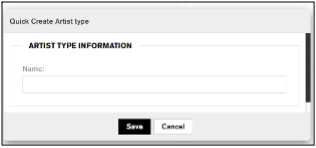
Artist type – one of any type that has been configured. There is a “+” button to open a Quick Create Artist Type dialog. Entering a new artist Type and clicking Save will add the artist type to this artist record.
Managing Agent – one of any agent that has been created. By typing a name in the field a list of matching agent names will display
Artist Code – is a unique identifier for an artist and is generated upon saving the Artist profile
Phone – phone number
Artist Notes: - text area to add a note for the Artist
Is Legacy: - a yes or no drop down signifying the artist is or is not from a legacy
An artist can have one or two contacts identified, and a contact has
Contact 1: – text field for title
Name - text field for name
Address 1 & Address 2 fields - for street address, apt, suite
Country – one of any configured country
State – one of any configured state that is linked to the country
City – one of any configured city that is linked to Country-State
Postal/Zip Code – state (or province) zip/postal code
Phone – phone number
Fax – fax number
Email – email address
Website – website URL (“Http://”)

Once an artist record is saved, there are several tabs under the Contact Info which can now be added to the artist profile.
Contact Info
Internal Note
To add an internal note for an artist profile first select the artist from the Artists list. The record once saved will display the Contact Info section below the artist details. Under Internal Notes click the Add Note button to open the Quick Note dialog. Enter text to the Note field and click Save. The note is then saved with the creation date, and the username that created the note.
A note can be edited by clicking the “pencil” icon to the right of the note record. A note can be deleted by clicking the “x” icon to the right of the note record and then click ‘OK to confirm the deletion. Additional notes can be added by clicking the Add Note button.

Production Preferences tab
A production preference is used to capture information about a contact which the artist prefers to work with. With the Production Preference tab selected, click Add button to add a preference. This creates a blank Production Preference record with the following fields:
The Type is a text field that can identify the role contact will perform
The Name field is the name of the preference
The Contact field is a text field to contain a contact reference
Email – email address of the preference
Phone – the number where the preference can be reached
Note – a note that pertains to the preference
Click Save Changes to save the preference. To edit a preference click into the field to be changed and click Save Changes. To delete a preference click the “x” icon to the right of the preference record and click “OK” to confirm the deletion. To add additional preferences click the Add button.

Finance tab
The Finance tab of Contact Info provides a place to add payment rates, taxation and service type for the artist.
To add details to the Artist Payment/Company Name click the “pencil” icon in the field, which opens the Edit Artist Payment/Company Name dialogue. The following fields are displayed:
Artist Payee Name is a text field for the payee name as it should appear on an invoice
Artist Rate is the rate % by default that should be paid to the artist for a job. This rate will appear by default as the Artist Split % on any job this artist has been added in the Rate section.
Agency Rate is the rate % by default that should be paid to the agency for a job. This rate will appear by default as the Agency Fee % in the rate
Note is a text field to contain a note specific to the artist/company payment information
To add a Tax ID click the Add Tax button to open the text field for a Tax ID
To add an Exception Rate click the Add Exception Rate button to open a new exception rate record. Multiple exception rates can be defined
The Exception Rate has three fields:
Note is a text field for a note specific to the exception rate
Select a company is a drop down to select a company for which the exception will apply. The company must have been added already.
Rate is the % exception rate that applies to the selected company
To remove an Exception Rate click the “pencil” icon to edit Artist Payment/Company Name and click the “-” icon to remove the rate.
Click Save Changes to save the information in the EDIT ARTIST PAYMENT/COMPANY NAME dialog.

To add a Default Service Type click the “pencil” icon to open the EDIT SERVICE TYPE pop-up. Click the service type drop-down to open the list of configured Service Types. Click Save Changes to save the selected default service type. When this artist profile is added to an option, the service type will now have a default value in the Rate section.

Portfolios tab
Portfolios are added from the Studio tab and are displayed under this tab. Portfolios will be discussed in detail in the section on Studio
Attachments tab
Files from your computer can be attached to the Artist profile from this tab.
Click the Upload Attachments button opens the Upload Attachments pop-up. To select a file click the Browse button to open the Windows File Explorer. Selecting a file and clicking Open adds a file to the upload area.
By default the file view is thumbnail in the Upload area, however there is a button to switch to List View.
There is a sorting button A-Z that you can select to sort attachments By name, By size or By date.
A button Clear list will clear all files currently added to the upload area. Alternatively, single files can be removed from the upload area by clicking the “x” icon on the file.
Clicking Upload will show a progress bar below the upload area until the upload is complete. The Upload button is replaced with a Cancel button to cancel the upload.
Once the file(s) are uploaded, then they are listed in the Attachments tab with attributes Name, Type (file extension), Date Uploaded and Uploaded By.


Tags tab
Tags can be added to an artist profile.

Click the “pencil” icon to open the Edit Tags pop-up. Enter a tag name, any existing tag matching the name entered will be listed and clicking Save Changes will add the tag to the list. One or more tags can be added while the pop-up is open. Clicking Cancel will close the pop-up and the added tag(s) will be displayed in the area below the Tags label.

Website tab
There are three sections to the Website tab:
Social Information for adding social media links
Bio to enter a biography for the artist
Additional Info to enter any additional text information about the artist

To add a social media link click the “pencil” icon in the Social Information area to open the Edit Social Info pop-up. Edit one or more of the following fields with the appropriate URL: Website, Twitter, Tumbler, Pinterest, RSS Feed, Facebook, and Instagram. Click Save Changes or Cancel to close the pop-up and return to the Website tab.

To add a Bio or Additional Info click the pencil icon in the area to open a RTF editor to add text, and or media to the area.

Additional Information tab
There are three sections to the Additional Information tab.
Contact Information is an area for an address
Phone & Fax is an area to add additional phone numbers
Extra Internal Information is a text field

To add Contact Information click the “pencil” icon to open the Edit Address pop-up with the following fields:
Address edit field
Address 2 edit field
Country drop down of the list of configured countries
State/Prov drop down, the states or provinces are linked to the current selection from the Country drop down
City drop down, the city is linked to the country and state/province selection
Zip/Postal Code is a text field for the entry of a zip code or postal code

Click Save Changes to save an address or click Cancel to close the pop-up without adding an address
To add additional Phone & Fax numbers click the “pencil” icon to open the Edit Phone & Fax pop-up with the following fields:
Alternate phone; Fax; Toll Free; Home Phone are each text fields for saving additional phone numbers.

Click Save Changes to save additional numbers or click Cancel to close the pop-up without adding numbers.
To add Extra Internal Information click the “pencil” icon to open the Edit Additional Information pop-up. The pop-up has a text field to save additional information.
Enter text to the field and click Save Changes button or click Cancel button to close the pop-up without adding information.

Chapter 4: Contacts
From this tab the user can add and maintain the contacts in the account. Clicking on the tab displays the list of Contacts in the right column and the filter options in the left column.
Contacts
The contact list column is displayed to the right of the filter options and the contacts are sorted alphabetically. A scroll bar is provided to scroll down and up the list.

Contacts Filter Options
Group
By default the filter tab Group is displayed with the All Groups checkbox checked. The individual groups are displayed below the All Groups. Clicking the checkbox of next to any of these groups will filter the list of Contacts by that group. One or more groups can be selected, and as they are selected a box is added above the filter. To remove items from the filter one can click to remove a check in a box or click the “x” in a box of the group. The Reset Filter link becomes enabled once a filter has been selected. Clicking the link will remove the filter and return the contact list to All Groups.

Adding a new group for contacts
Clicking the “+” button next to All Groups in the sidebar will open the Quick Create Group dialogue.
Enter a group name and click Save to save and close the dialogue or click Cancel to abort and close the dialogue

Tag
Clicking the Tag filter option shows the available tags that have been added to contacts, and by default the All tags is checked. Clicking a tag will filter the list of Contacts by those who have this tag. Clicking multiple tags will filter the list of Contacts with any of the selected tags.
Filtering by tag shows the number of contacts that have that tag.

Search…
Above the filter options is a search field with a search button to search the contacts by name or email for full or partial match. By entering text into the field and clicking the search button (magnifying glass) the search results returned is the list of contacts that match the search criteria in contacts name or email address.
Combining Tags and Types with Search
By combining a search field with tags for Group and Tags will further narrow the contact names returned in the list.
Sort Contacts
Clicking on the Sort button opens a list of sorting options for Contacts, and a checkmark will display next to the current option.
Options available for sorting are By First or Last Name, By First Name, By Last Name, By Company A-Z, By Company Z-A and Recent
By First or Last Name: Choosing this option sorts the list of contacts alphabetically by the first or last name, which appears earliest. A name such as ‘Adam West’ will appear with the ‘A’s in the list.
By First Name and By Last Name display the list alphabetically by either the name selected.
By Company A-Z and By Company Z-A: Choosing this option will sort the list of contacts alphabetically by company name, rather than by the contact name. You may choose to sort the list ‘A’ to ‘Z’ or in reverse order ‘Z ‘to ‘A’.
Recent: This is a special case that displays the most recently added contact records first, in a reverse-chronological order. That is to say, the most recently added contact record appears first, and the oldest contact record by creation date is displayed last.
Paging the list
If the list is longer than can be displayed on a single page then the page next and page previous arrows above the list are enabled.
List by character
The contacts can be filtered by the first character of the first name, or last name, by clicking that letter from the list column. To remove the filter by letter, click the “*” at the top of the alphabet.
Select ALL
The Select All link will select all the contacts currently displayed and will open a Batch Actions panel. The action Tags allows the user to add a tag to all the contacts selected. Type a tag title and press enter to add an existing tag or create a new tag, press enter and click Save to save the tag to the contact. An action Groups allows the user to add the selected contacts to one or more groups by clicking the check-box next to the group name and clicking Save

Companies
Clicking the Companies from the sidebar will display the list of Companies in the right column. The companies are sorted alphabetically. A scroll bar is available to scroll the list.
If the list is longer than can be displayed on a single page then the page next and page previous arrows above the list are enabled.

Search…
Above the filter options is a search field with a search button to search the companies by name for full or partial match. By entering text into the field and clicking the search button (magnifying glass) the search results returned is the list of companies that match the search criteria.
Sort Companies
Clicking on the Sort button opens a list of sorting options for Companies, and a checkmark will display next to the current option.
Options available for sorting are By Company A-Z, By Company Z-A and Recent
By Company A-Z and By Company Z-A: Choosing this option will sort the list of companies alphabetically by company name. You may choose to sort the list ‘A’ to ‘Z’ or in reverse order ‘Z ‘to ‘A’.
Recent: This is a special case that displays the most recently added company records first, in a reverse-chronological order. That is to say, the most recently added company record appears first, and the oldest company record by creation date is displayed last.
Add New Contact+
Clicking the Add New Contact+ button opens the new contact panel
Required fields include the following fields which are indicated as (required) within the field and by an asterisk “*” next to the field:
First name – text field for name
Last Name – text field for name
Email – a text field for email address
Optional fields include
Title – a text field for the position of the contact
Contact Manager – drop down list of all the Agents that have been defined
Phone – phone number text field
Mobile – mobile phone text field
Client section
To add client details to the contact, click the Client drop down and type the name of an existing or new company name and press the <Enter> key. Once a client name has been selected the remaining fields become enabled…
Address 1 & Address 2 fields - for street, apt, suite
Country – one of any configured country
State – one of any configured state that is linked to the country
City – one of any configured city that is linked to Country-State
Postal/Zip Code – state (or province) zip/postal code
Phone – phone number
Fax – fax number
Email – email address
Website – website URL (“Http://”)
Copy address from Company button will copy the address details of a Company to the client address details
Bill To section
To add details to the Bill To section, click the Bill To drop down and type the name of an existing or new company name and press the <Enter> key. Once a Bill To name has been selected the remaining fields become enabled…
Name – is a text search field for a contact name. Clicking in the field the user can enter an existing contact name or click to open the Quick
Address 1 & Address 2 fields - for street, apt, suite
Country – one of any configured country
State – one of any configured state that is linked to the country
City – one of any configured city that is linked to Country-State
Postal/Zip Code – state (or province) zip/postal code
Phone – phone number
Fax – fax number
Email – email address
Website – website URL (“Http://”)
Copy address from Client button will copy the address details from the Client section to the Bill To: address details
Company section
To add details to the Company section, click in the Company field to enter a new or existing company name
Address 1 & Address 2 fields - for street, apt, suite
Country – one of any configured country
State – one of any configured state that is linked to the country
City – one of any configured city that is linked to Country-State
Postal/Zip Code – state (or province) zip/postal code
Phone – phone number
Fax – fax number
Email – email address
Website – website URL (“Http://”)
Copy address from Bill To button will copy the address details from the Bill To section to the company address details. Note: Clicking this button will update the current address of the company record
Save and Cancel buttons are displayed at the top of the Contact details panel

Once a contact record has been saved there are additional Contact Info sections that are enabled.
Internal Notes
This section displays any notes that have been created for the Contact. To add a note click Add Note button to open the Add Note pop-up and enter text to the Note: field and click Save
Tags tab
This tab is split into sections for Tags and Groups

Tags can be added to a contact profile. Click the “pencil” icon to open the Edit Tags pop-up. Enter a tag name, any existing tag matching the name entered will be listed and clicking Save Changes will add the tag to the list. One or more tags can be added while the pop-up is open. Clicking Cancel will close the pop-up and the added tag(s) will be displayed in the area below the Tags label.

The contact can be added to one or more groups. Click the “pencil” icon to open the Edit Groups pop-up. Click one or more checkboxes of existing Groups and click the Save Changes button or click Cancel to not add the contact to any additional groups.

Communication tab
This tab displays any communications that have been directed to this client. See “Communications” section of this guide.

Attachments tab
Files from your computer can be attached to the Contact profile from this tab.

Click the Upload Attachments button opens the Upload Attachments pop-up. To select a file click the Browse button to open the Windows File Explorer. Selecting a file and clicking Open adds a file to the upload area.
By default the file view is thumbnail in the Upload area, however there is a button to switch to List View.
There is a sorting button A-Z that you can select to sort attachments By name, By size or By date.
A button Clear list will clear all files currently added to the upload area. Alternatively, single files can be removed from the upload area by clicking the “x” icon on the file.
Clicking Upload will show a progress bar below the upload area until the upload is complete. The Upload button is replaced with a Cancel button to cancel the upload.
Once the file(s) are uploaded, then they are listed in the Attachments tab with attributes Name, Type (file extension), Date Uploaded and Uploaded By.

Additional Information tab
The Additional Information tab is divided into four sections:
Contact Information is an area for an address
Phone & Fax is an area to add additional phone numbers
Extra Internal Information is a text field
Social Information for adding social media links

To add Contact Information click the “pencil” icon to open the Edit Address pop-up with the following fields:
Address edit field
Address 2 edit field
Country drop down
State/Prov drop down, the states or provinces are linked to the current selection from the Country drop down
City drop down, the city is linked to the country and state/prov selection
Zip/Postal Code is a text field for the entry of a zip code or postal code
Click Save Changes to save an address or click Cancel to close the pop-up without adding an address

To add additional Phone & Fax numbers click the “pencil” icon to open the Edit Phone & Fax pop-up with the following fields:
Alternate phone; Fax; Toll Free; Home Phone are each text fields for saving additional phone numbers.
Click Save Changes to save additional numbers or click Cancel to close the pop-up without adding numbers

To add Extra Internal Information click the “pencil” icon to open the Edit Additional Information pop-up. The pop-up has a text field to save additional information.
To add Extra Internal Information enter text to the field and click Save Changes button or click Cancel button to close the pop-up without adding information

To add a social media link click the “pencil” icon in the Social Information area to open the Edit Social Info pop-up. Edit one or more of the following fields with the appropriate URL: Website, Twitter, Tumbler, Pinterest, RSS Feed, Facebook, and Instagram. Click Save Changes or Cancel to close the pop-up and return to the Additional Information tab.

Add New Companies+
Clicking the Add New Company+ button opens the company details edit panel
The company details are divided into four sections
General Information section includes the following fields
Company Name – is text field for the company name
Company Type – is a drop down list of the available company types
Is a supplier – is a checkbox to identify a company as a supplier
Reference token – not enabled for edit
Reference characters – abbreviation for company reference. This is system generated as the initials of the company name on saving the new company
Reference Number – a number specific to the company. This is a system generated number upon saving a new company
Contact Information section includes the following fields
Address – address field
Address 2 – address field
Country – country drop down
State – state drop down linked to the country selected
City – a city drop down linked to the country and state selected
Postal Code – the zip or postal code for the address of the contact
Phone – phone number
Fax – fax number
Website – website for the company
Email – email address for the company contact
Facebook – Facebook page for the company
Twitter – twitter account for the company
Comments section has one field for a comment that can be entered directly to the field
Billing Information section includes the following fields
Address - address field for billing
Address 2 – address field for billing
Country - country of the billing address
State – state of the billing address
City – city of the billing address
Postal Code – zip/postal code for the billing information
Phone - phone
Fax - fax number for billing contact
Email – email address for billing contact
Tax Id – a text field for saving a taxation number
Account Id – a text field for saving an account Id
Vat Id – a text field for saving a value added tax identifier
Agency Commission – the default commission in %
Financial Status is a radio button with Ok, Hold and Block
Financial Notes: text field for entering a note for financials for this company
Save and Cancel buttons are displayed at the bottom of the Company details


Selecting a Company from the list will display the summary view with the Company Name at the top, followed by the Address and Contact sections. There are two tabs below the company summary called Contacts and Jobs
Contacts
Displays the list of contacts that are associated with the select company with Name, Email, Phone and Title fields displayed from the contact record.

Jobs
Displays the list of Jobs where this company is the client with the fields Job #, Name (job name), Agent, Artist, Status and Date.
Edit and Delete buttons are displayed on the far right of the Company Name

Chapter 5: Studio
In the Studio you will find simple yet powerful tools for creating portfolios that can be published to your website and launched as email marketing campaigns. You can also publish images to social media channels along with a custom message. LOOKBOOKSpro can provide a special link to your Twitter, Tumblr and Facebook accounts which will drive traffic back to your website.
A simple organizational structure employed in Studio, consisting of categories, tags and associations maximizes efficiency for portfolio design, launching email marketing campaigns, and linking client portfolios to their profile page.
The STUDIO page is has three components, the sidebar and two content panes.
The sidebar houses links to categories (i.e. photographers, etc.), a list of artists organized under each category and a list of the portfolios displaying each artist’s work.
The Upper Pane is where the portfolio that you are working on is displayed. A menu list on the left side of the pane houses the tools needed to work with portfolios. Portfolios can also be moved to the bottom pane (workbench) to take advantage of the tools available for searching through large numbers of assets.
The Bottom Pane (workbench) is where unassigned assets are displayed by default. Unassigned Assets are images that are available for general use, as opposed to images that have been uploaded to a portfolio. The workbench houses tools including: Search by Tag, Search by Keyword, create spreads, and upload and tag images. Workbench settings can be altered in Admin. (I.e. the workbench can be enlarged to display more images, and the space between the images can be expanded or reduced. For more information on altering workbench settings See section: Admin).

In this chapter you will learn how to:
Develop a list of categories to organize artists according to the type of work they do
Add an artist to the relevant category
Design portfolio(s) to display the artist’s work for publication and mail-outs
Select cover images for portfolios
Tag images – Organize images using specific words or phrases that help identify the image
Associate images – Select which client(s) are represented in/by an image (i.e. photographer, model, fashion designer, etc.)
Categories
Artists are commonly categorized by the type of work they do. I.e. photographer, hair stylist, makeup artist, etc. With LOOKBOOKSpro you can create a categorization strategy that is pertinent to your agency’s needs. After they have been created, categories are displayed in the sidebar.

Add a category
- Click STUDIO on the navigation bar
- Click the Add Category+ button at the top of the sidebar to open the Add Category dialogue
- Type the category name in the text field
- Click Add to save and Cancel to discard

Warning – New categories appear at the bottom of the sidebar and the same category can be added multiple times, which can lead to confusion. If you do not alphabetize your category list, look it over carefully to see if it has already been added.
Note - Categories can be re-organized at any time by using drag and drop. (Click the category name in the Tree and drag and drop it in the area in which you want it placed. If drag and dropped onto an existing folder in the tree, the category will be added as a sub-folder).
Delete or Un-Delete a category
- Click STUDIO on the navigation bar
- Scroll through the list of categories in the sidebar
- Click the category name you want to delete and click the Menu button from the top pane menu list
- Choose the Delete Category option at the bottom of the menu

- A pop-up menu will open with message “Are you sure you wish to delete this container?”
- Click OK to confirm deletion or click Cancel to abort

Alternatively to delete a category right-click on the category name from the sidebar and choose Delete from the context menu.
Deleted categories will appear under Deleted Containers in Admin, where they can be un-deleted. (For more information on Un-Delete Containers See section on Admin)
Containers
In studio you have a list of categories; each category is populated with several artists and each artist has a list of portfolios in which his/her work is displayed. A category, with all its artists and portfolios is called a container. When you delete a category, you delete the entire container. You can go into Admin, and restore the entire container. (See section on Admin)
Create an Artist Profile
- Click STUDIO on the navigation bar
- Click the category (i.e. photographer) in the sidebar that you would like to have the artist placed in (Add a Category
- if you do not find the category you are looking for)
- Click “+” (Add) button on the top pane menu list to open the Add… dialogue
- Select Artist from the ‘Type’ drop-down-menu (The default setting is Content)
- Enter the artist name in the text fields for First Name and Last Name
- Click Add to save and Cancel to discard

Portfolios
After you have added an artist to the container you can begin to add portfolios to display the artist’s work. If you use the ‘Association’ tool to link portfolios with the clients whose work is represented in them, the portfolios can be viewed on the client’s profile page.
Create a portfolio
- Click STUDIO on the navigation bar
- Click the artist you would like to create a portfolio for
- Click the “+” (Add) button on the top pane menu list to open the Add… dialogue
- Select Content from the ‘Type’ drop-down menu
- Type a name for the portfolio into the text field. Short, specific titles make navigation easier – 23 characters are visible in the sidebar, although you can mouse over the title to view a longer title) and 13 characters are visible in the portfolio title on the top pane
- Click Add to save and Cancel to discard. When you click Add the portfolio name is listed in the sidebar under the artist name

Add Media to a Portfolio
You can add media (images, video, etc.) to your portfolio from your computer or from Unassigned Assets in Studio.
Add Media to a Portfolio from your Computer
- Click STUDIO on the navigation bar
- Click the category the artist is organized under, click the artist’s name, click the portfolio name in the sidebar or double click the portfolio in the top pane that you want to add media to.
- Click “+” (Add) button to open the Upload Media dialogue box
- Click Browse, to locate the image(s) on your computer that you wish to upload. Click the image. Click open. You can add a single image or a batch of images. To add a batch, repeat the steps and click browse; image; and open; until you have loaded the complete batch of images into the Upload Media Window. The window will expand to meet the demand. Note: When images are uploaded in batches, tags and associations (discussed later) are applied to all the images in the batch.
- Do not click Upload until the remaining steps have been completed. However, If you do click upload at this point, you can go back and complete the remaining steps using the edit and tag selection tools.

Marketplace Tags
Marketplace tags are pre-configured groups of tags. To add a marketplace tag click on a drop-down of any group and make a selection. This adds the tag to the Tags list. A new tag can be entered to the group by typing a word or short phrase in the group drop-down and pressing enter/return key.
Tags
To add a custom tag a word or short phrase to describe the image (i.e. Men’s Fashion).
Press the enter/return key after each tag is typed into the text field. Note: If you delete an image before it is uploaded, the tags remain. If you decide to browse for a new image, remember to delete each tag that does not apply to the new image you select, by clicking the “x” beside the tag. (For more information on tags see section on Admin)
Associate the image with artists
When you associate an image with a client, a link is not created to the client’s profile; however, when you associate a portfolio with a client, a link is created to the client’s profile page. When associations are made between images and clients during the upload process, it can make it easier to select associations for portfolios, later. To select clients, first you need to display a list of clients in the middle column. Then you can check the box beside each client whose work is represented in the image.
Note: If associations are made later using the Edit feature, be sure to click save after you make your selections.

Delete an image before it is uploaded
Before you click upload, you can delete the image(s) you selected by clicking Remove that appears to the right of the image. To delete all the images that you selected click the Cancel button. To clear a tag, click the “x” in the tag box. To clear an association, click the check box beside the artist's name to remove, selecting the artist will also remove.
Upload
After you have completed each item in the dialogue box, click Upload. Be sure to wait until the upload is completed before continuing.
Add Media to a Portfolio from Unassigned Assets
Unassigned assets are images that have been uploaded to Studio for general use, as opposed to being uploaded to a specific portfolio. Unassigned assets are displayed in the bottom pane in Studio by default
- Click Studio on the navigation bar
- Click the category the artist is organized under, then click the artist’s name and then double-click the portfolio in the top pane or click the title of the portfolio in the sidebar where you want to add images.
- Locate the image(s) in Unassigned Assets that you want to move to the portfolio. Scroll through the images using the scroll bar on the right
There are two ways to display images in a portfolio. They can be displayed as individual images or as a spread (2 images in one thumbnail).
Option 1 Individual images - Select the desired portfolio. Click the image(s) in Unassigned Assets (lower pane) that you want to place in the portfolio and drag and drop the image into the portfolio. If you want to add a batch of images to the portfolio, click on each image that you want to add for click Select All, and then click the Selection drop down and choose Add to Contents.
Option 2 - Create a Spread (2 images appear in the thumbnail)
- Open a portfolio in the top pane.
- Right-click on an image you want to add to a spread
- Choose Add to Spread and the image is added to the Spread Creator
- Select a second image the same way
- With two images, the switch buttons are enabled to change the order of the spread images
- Click the Create Spread button from the spread creator to add the spread image to the portfolio

Select and De-select a Cover Image for a Portfolio
- Click STUDIO on the navigation bar
- Click the category the artist is organized under, then click the artist’s name and then double-click the portfolio in the top pane or click the title of the portfolio in the sidebar where you want to add images.
- Right-click the image you wish as a cover image. Click Make Cover. To change a cover image, perform the same action on a different image. You can remove the cover image and leave the field blank by right-clicking and choosing Remove Cover

Remove an Image from a Portfolio
To remove an image from a portfolio, right-click on the image and choose “Remove”. It is better to use the “Remove” command than the “Delete” command as with the delete, the image will be deleted from all portfolios where that image has been used, and will not be deleted as a cover image on a client’s profile page. The following steps can remove one or more images from a portfolio
- Click Studio on the navigation bar
- Click the category the artist is organized under, then click the artist’s name and then double-click the portfolio in the top pane or click the title of the portfolio in the sidebar where you want to remove images.
- Click one image or press and hold the Ctrl key and click the assets you want to remove
- Right-click on the selection and choose “Remove Selection” from the context menu

Re-Organize the Images in a Portfolio
To reorganize the images in a portfolio, left-click and hold on the image and drag it to the new location and drop it.
View an image
LOOKBOOKSpro can also display assets in a larger view and provide a link to share them on Twitter, Facebook or Tumblr accounts or to download them to your computer. To open the viewer, select the asset and click the arrow “>” and choose View command from the menu.

In the Viewer there are arrow controls to move to the previous or next asset and show the currently selected file name.

There are also actions to Share, Download, Full Screen mode or Exit the Viewer
Clicking the Share command opens the sharing dialogue
Clicking the “X” command closes the Viewer and returns to the previous Studio display
Edit a Portfolio
The edit feature in portfolios can be used for corrections and updates to the portfolio details. The “Edit” command is available from the top pane menu.
Note: To edit the details of an image within the portfolio, right-click on the image and choose the “Edit” command from the context menu. Use the portfolio-edit command to:
- Publish your portfolio to your website and choose a “Publication Date” from a pop-up calendar
- Add or update a portfolio description
- Add or remove Tags to a portfolio
- Associate a Portfolio with Clients (It is not enough to associate images with your clients, it is important to associate your portfolios with your clients to have them linked to their client profile page.)


To edit a portfolio:
- Click STUDIO on the navigation bar
- Click the category the artist is organized under, then click the artist’s name and then double-click the portfolio in the top pane or click the title of the portfolio to edit
- Click the menu icon from the top pane and choose “Edit” to open the “Edit Details” pop-up
- See the previous section on creating a portfolio for details of adding images, a description and selecting Tags and making Associations
- Click Save to save the changes or Cancel to abort the changes
- Click the Preview button to open a new tab to preview the portfolio from your website
Publish or Un-Publish Portfolio
After your portfolio is completed you can publish it to your website.
- Click STUDIO on the navigation bar
- Click the category the artist is organized under, click the artist’s name, click the portfolio name that you want to publish or un-publish in the sidebar or double click the portfolio in the top pane
- Click the menu icon from the top pane and choose “Publish toggle” to publish your portfolio to the website and click again to Un-Publish and remove the portfolio from the website (An alternate publication date can be selected by clicking edit rather than publish from the menu list)
- Published images will appear in full color and Un-published images appear in lower contrast. Note: Images that are not published will not be seen from a campaign email.
Search for Images in a Portfolio
There are two ways to search for images in a portfolio. In a smaller portfolio you can scroll through the images. To view more images in the portfolio at one time you can enlarge the top pane by clicking on the down arrow at the left of Unassigned Assets menu list. The workbench will collapse from the screen, enlarging the top pane. To return the workbench to the screen click the bottom pane margin. For larger portfolios you may want to load the images into the workbench, where you can conduct a search using keywords or tags.
To load a portfolio into the workbench
- Click STUDIO on the navigation bar
- Click the category the artist is organized under, then click the artist’s name, then right-click or click the arrow on a portfolio you wish to load and choose “Load all contents in workbench”. The contents of that portfolio will display in the bottom pane (workbench).
- To restore the unassigned assets to the workbench click the menu button and choose “Reset Asset Drawer"


Unassigned Assets
Unassigned assets are media images (i.e. photos, videos, etc.) that have been uploaded to the studio library as general media items, rather than being uploaded to a specific portfolio. By default these images are visible in the Studio Workbench (bottom pane). Unassigned assets should be given a title and marked with descriptive tags during the upload process to make it easier to find them through
Search by Keyword or Search by Tags. Unassigned assets may be used in documents such as client profiles, news posts, pages, or moved into portfolios.
Add Media to unassigned assets
- Click Studio on the navigation bar
- Click “+” (Add) button from the workbench (lower pane) to open the “Upload Media to Unassigned Assets” pop-up. To complete the ‘Upload Media’ dialogue box, follow the same steps outlined in Add Media to a Portfolio from your Computer
Edit Assets
To edit the title, description, tags and associations for individual images
- Right-click the image you want to edit and choose “Edit” from the context menu
- Complete the changes you wish to make
- Click Save to make changes and Cancel to discard changes
- Assets in the workbench, a portfolio or in unassigned assets can be edited in the same way

Tag Selection (For single or multiple images)
Tags are short, specific, pieces of information, single words or short phrases that help you identify an asset. They are used to search for images using “Search by Tag”. Tags are usually added during the upload process but they can be added later using edit or tag selection. Tag selection enables you to add tags to more than one asset that can be identified using the same tags.
To select multiple assets click “Select All” from the selection menu or left-click and press and hold the Ctrl key and click multiple assets. The “Tag Selection” command is available from the “Selection” menu in the upper pane for portfolio images and the lower pane for unassigned assets as well. Click Save button or click Cancel to abort Tag Selection and close the pop-up.

Search for Assets in the Workbench in Studio
Unassigned assets appear in the workbench by default. However, portfolios can be loaded into the workbench by clicking the small arrow to the right of the portfolio title in the sidebar. (The arrow appears when you mouse over the title)
From the Search tab in the sidebar, you can search for assets in the workbench in Studio by scrolling through images or by using Search By Keywords or Search By Tag Keywords, are taken from the asset title and contact name of assets and tags must be connected to the asset at the time it is uploaded or later using the edit or tag selection features.
To perform a search of assets in the workbench
- Click STUDIO on the navigation bar
- Click the Search tab from the sidebar
- Enter a descriptive word or phrase into the Search field. This will return tags and contacts that match the keyword or phrase
- Click on a tag or contact that is displayed or click the Search button or press the ‘Enter’ key from the search field.
- The workbench now contains the assets as filtered by the search criteria selected
- To return the unassigned assets to the workbench click the menu list and choose Reset Asset Drawer
Active Filter
The Active Filter area will display all the keywords, tags and associations that you are using to filter the workbench assets.
To remove a filter from the Active Filter area click on the right end of the keyword in the Active Filter.
To remove all filters, click the ‘X’ above the Active Filter area and the workbench will now display all the assets.
Negative Searches
A ‘negative’ search refers to a method by which you can exclude a keyword, association or tag from the list of assets returned. By preceding the keyword in the Search field with ‘-‘, you can exclude that keyword from the asset list. Negative search keywords will appear in red in the Active Filter
- For example if the original search by keyword was ‘House’, by typing an additional keyword ‘-garden’ the list will exclude those results which also have the keyword ‘garden’.
You can also use the ‘-‘ symbol to exclude an association or a tag from the results. Enter the tag or association to the Search field preceded with the ‘-‘ symbol and click the tag or association when it is displayed below the Search field. Negative search tags will appear in red in the Active Filter.
- For example if the original search by keyword was ‘House’, by typing the contact name or tag name of ‘-advertising’ and click the tag the list will exclude those results which have a tag of ‘advertising’

Wildcard Searches
A wildcard search refers to a method of search where you might wish to search that begins or ends with a keyword. By placing a ‘*’ (asterisk) preceding the keyword or appended to the keyword, will filter the list of assets accordingly.
- For example if you wish to return the list of assets for ‘football’, ‘baseball’ and ‘basketball’ you might enter ‘*ball’ to the search field and press Enter key. Or if you wished to return by keyword that began as ‘sun’ you might enter ‘sun*’ to the search field and press Enter key. The list might return ‘Sunday’, ‘sundae’, ‘sunglasses’ etc.

Filter Options from the Workbench Menu
Filter

Clicking the Filter button from the workbench menu list opens a list of filter options that can also be used with the Search by Keyword, or Search by Tag. Options chosen from Filter will appear in the Active Filter
By default the None filter option will be checked.
Choose Portrait or Landscape to filter the assets by the chosen alignment. These filter options are mutually exclusive and only one can be selected at a time. In other words only one or the other can be true, but not both.
Choose Published or Unpublished to filter the assets by the chosen publishing state. These options are mutually exclusive and only one can be selected at a time.
If Labels have been configured to provide a status for an asset these will be displayed in the filter options. Choose one or more statuses to filter the list of assets. Labels/statuses can be added through the Admin page and are found under Configuration.
Choose one or more of the Star Ratings to filter the assets by the rating they received of 1 to 5 stars.
Date
Clicking the Date button from the workbench menu list opens a list of filter options for the creation date of an asset. These can also be used with search keywords or tags. Options chosen from Date will appear in the Active Filter.
Choose Specify Dates to filter the asset list by a specific date. Choosing the option opens a date picker whereby you can click a date and the Apply button to filter the list.
Choose Month to Date to filter the asset list by a creation date in the last month.
Choose Last month to filter the asset list by a creation date in the previous month.
Choose Last 30 days to filter the asset list by a creation date in the last 30 days.
Choose Year to Date to filter the asset list by a creation date in the current year.
Artists
Clicking the Artists button from the workbench menu opens the Browse Artists dialogue to choose one or more Artists on which to filter the assets. This filter can be used with keyword or tag searches. Options chosen from Artists will appear in the Active Filter
Sort
Clicking the Sort button from the workbench menu opens a list of sorting options for dates.
Date Uploaded, Date Modified and Date Published are options to sort assets and Ascending or Descending can be selected for the order.
Delete and Un-Delete Studio Assets
When you use the delete feature to remove assets from a portfolio or from unassigned assets, that image will be permanently deleted from all the portfolios it has been placed in. Although you can Un-delete the Asset in Admin, it does not restore the Asset to the portfolios; it does, however, restore it to the unassigned assets. When you delete an asset that has been used as a cover image for a client profile, the cover image does remain on the client profile page. To remove an asset from a portfolio, if you want it to remain in other portfolios, it is better to use the Remove Selected feature. (See Remove an image from a Portfolio)
To delete an asset
- Click Studio on the navigation bar
- From either the portfolio pane or workbench, click the arrow on the image you want to delete and select the Delete command. A confirmation pop-up will open
- Click OK to delete the asset or Cancel to abort (To Un-Delete See section on ADMIN)
Quick Send Portfolios from Studio
- Click Studio on the navigation bar
- Click the category the artist is organized under, then click the artist’s name, then click the portfolio name in the sidebar or double click the portfolio in the top pane that you want to ‘Quick Send’.
- Click the menu icon and choose Quick Send command. This will open the Add New Campaigns dialogue on the Campaigns tab. Add New Campaigns is covered in the chapter on Campaigns.
Re-Organize Categories, Artists and Portfolios
Categories, Artists and Portfolios automatically organize themselves in the order in which they were created with the latest additions appearing at the bottom of the sidebar. To rearrange the order simply left-click item you wish to move, hold the mouse button, and drag it to the desired location and drop it by releasing the mouse button.
Inspector sidebar
The Inspector appears as the right sidebar and will display the currently selected asset from the portfolio or the workbench, along with its attributes. Some of the attributes are static, in that they cannot be modified in the Inspector. These include Name, Dimensions, Size, and Meta info and a label for file type (png, jpeg, etc.). Other attributes can be modified for the asset…
Edit Tags from Inspector
Click the ‘pencil’ icon from Inspector next to Tags opens the Edit Media Details dialogue where Tags can be added and/or removed.
Rating from Inspector
Assets can be rated using a one to five Stars. Click on a star in the Rating section to provide or change a rating. Clicking on ‘x’ will remove a rating from the asset.
Edit Associations from Inspector
Associations are connections between the asset and the client/artist.
Click the ‘pencil’ icon from Inspector next to Associations opens the Associations dialogue where Associations can be added and/or removed in Inspector
Containers from Inspector
Containers is a path from the category, to the artist and the portfolio of where the asset is displayed. There can be more than one container listed in this section of Inspector if that asset is used in more than one portfolio.
By clicking on a container, the portfolio where the asset is located will open in the upper pane.
Lightbox view
A lightbox is a way to preview images from Studio in preparation of a campaign. You can add images to a lightbox from portfolios or the workbench and preview the images individually from the lightbox view or as a web page. You may also email the lightbox contents as a web page link, a pdf link or as a pdf attachment to the email.
Open lightbox
To open lightbox, click on the show/hide lightbox link at the far right of the navigation menu. The Studio now displays the lightbox in the upper pane with all the images that have been added to the lightbox and the workbench pane is closed.

Lightbox menu at the bottom of the pane has the following options:
Asset menu in lightbox
Right-click on an asset in lightbox to open the asset menu.
Edit – clicking the Edit command will open the Edit Media Details dialogue
Copy to … - clicking the Copy to command will open containers where the image will be copied
Copy to recent … - will open the recently selected containers where the image can be copied

Adding or removing an image to Lightbox
Click the arrow “>” at the top right of the image from a portfolio or the workbench and click command Add to lightbox. The “flag” icon on the top left of the image will turn from gray to white, indicating that this image is in the lightbox. Alternatively, clicking the flag icon itself will toggle the image to in or out of the lightbox. The link to lightbox at the far right in the navigation menu will increment by 1 the number of images currently in lightbox. To remove an image from the lightbox, you can click to open the menu and choose Remove from lightbox command.
Template – by default this template is Lightbox. The template defines the layout when sharing the lightbox through email. Another predefined template is available called Campaign email.
Send – opens an email form to email the Lightbox contents to recipients from your contacts.
Clone – Allows you to clone the lightbox contents as a new portfolio.
Click Clone and provide the container where the portfolio will be created from your lightbox assets.
Click the destination container field and select the container.


Clear – will clear the current assets from lightbox. It does not delete the assets, the button click opens a confirmation dialogue and on clicking “OK” , clears all assets from the lightbox view.
Sending Lightbox assets
Choose a template and click Send to open the email form
Choose contacts and groups as follows:

Under Browse choose the recipients:
To draw up a list of recipients to send your email to, you need to display a list of contacts in the second column, where you can place a check in the box beside each recipient you wish to send the email to. You have four options for displaying contact lists:
Option 1: Click Recent to display the list of contacts you have recently worked with in LOOKBOOKSpro
Option 2: Click A-Z or Z-A for an alphabetical listing of contacts
Option 3: Click By Company A-Z or Z-A for a list of contacts organized by company
Option 4: Click a group for a list of contacts in that specific group. Use the scroll bar to see the complete list of groups
Add New Contacts
To add more contacts to the lists (contacts that have not already had profiles created) click the + symbol beside Contacts and complete the dialogue box. More details can be added to the new contact profile later using the edit feature in the Contacts page.
Recipients
Each of the contacts selected appear under the Recipients column. At least one contact must be added as a recipient
From Name defaults to the user currently logged in
Email defaults to the email address of the user
Subject is a required field in the email form
Message is an optional field and can be left blank
Send as options
There are three options for sending the assets in email:

Email – sends the email with the cover image for the lightbox assets as linked to a temporary web page. When the email is received the recipient clicks the cover image to open a web page where the lightbox assets are viewed one at a time.
PDF link – sends the email with a link to a PDF of the lightbox assets. When the email is received the recipient clicks the link to open the PDF in a web page.
PDF attachment – sends the email with a PDF attached. When the email is received the recipient can open the attachment in their pdf reader.
Sending email options

Clicking Send button will send the email to the recipient list
Send Preview button will send the email form as a preview of a campaign
Save draft button will save the email form as a draft which can be accessed from the Communications tab. See the chapter on Communications for more details.
Cancel button will cancel the email form and return to the Lightbox view
Chapter 6: Communications
In Communications you can launch campaigns and then track recipient response to these marketing activities. Each time portfolios are sent to recipients, from the Studio, data regarding the mail-out is automatically compiled in the communications window. You can determine which emails were opened and even which images your visitors were interested in.
Campaign titles appear in the sidebar of the Communications window, organized according to the date they were emailed. The top pane of the content area provides data in numeric and graphic form that keeps you updated on:
- Emails sent, delivered, opened and/or bounced
- Links clicked
- Unsubscribed rates
From Communications you can also launch newsletters and track their recipient response. Clicking the Newsletter tab of the sidebar shows the list of templates created for newsletters. By selecting a template the second column displays the newsletter titles according to the date there were emailed. Selecting a newsletter displays the top pane of the content area provides data in numeric and graphic form that keeps you updated on:
- Emails sent, delivered, opened and/or bounced
- Links clicked
- Unsubscribed rates
In this chapter you will learn to:
- Associate campaigns with clients
- Tag campaigns
- Launch Campaigns
- Review Campaign Status and Response Data
- Clone campaigns
- Create templates for newsletters
- Email newsletters created from templates
- Review Newsletter status and Response Data
Campaigns
Campaigns are launched from the Campaigns page. However, you can access the Quick Send for campaigns from the Contacts and Studio pages. To launch a campaign from the Campaign page, click the + symbol beside CAMPAIGNS in the sidebar. Launching a campaign involves a three-step process:
Step 1 - Choose a Portfolio(s).
Step 2- Choose Contacts/Groups.
Step 3- Customize and Schedule.
1. Choose Portfolio(s)
See the figure below to see the Choose Portfolio dialogue box. To select portfolio(s) for you campaign, you will need to click the artist’s name in the second column to display the titles of his/her portfolios in the third column. You have three options for displaying artist’s names in the second column.
Under Browse in column 1:
Option 1: Click Recent to display a list of all the artists recently worked with in the Studio page.
Option 2: Click A-Z or Z-A for an alphabetical listing of all artists.
Option 3: Type the name of the artist in the text field.
Click the portfolio(s) that you want in your campaign. Once selected, the list of portfolios appears in the Campaign Summary box, on the right.

2. Choose Contacts/Groups
See the figure below:
Column 1: Browse
To draw up a list of recipients to send your email marketing campaign to, you need to display a list of contacts in the second column, where you can place a check in the box beside each recipient you wish to send the email to. You have four options for displaying contact lists:
Option 1: Click Recent to display the list of contacts you have recently worked with in LOOKBOOKSpro.
Option 2: Click A-Z or Z-A for an alphabetical listing of contacts.
Option 3: Click By Company A-Z or Z-A for a list of contacts organized by company.
Option 4: Click a group for a list of contacts in that specific group. Use the scroll bar to see the complete list of groups.
Add New Contacts
To add more contacts to the lists (contacts that have not already had profiles created) click the + symbol beside CONTACTS and complete the dialogue box. More details can be added to the new contact profile later using the edit feature in the Contacts page.
Campaign Summary
Each of the recipients that you selected, appear under To: in the CAMPAIGN SUMMARY box. You can de-select a contact by clicking the name in the campaigns summary box. A pop-up window will appear, asking if you are sure.

3. Customize
Send immediately
Send immediately is the default setting. If you are not ready to launch the campaign immediately, click save draft and launch the campaign at a later date.
From Name: and Email:
These fields are completed by default.
Subject:
Type a subject into the text box. The campaign will not send if this field is not completed.
Tags
Adding tags to your campaign makes it easier to search for the campaign. Tags are specific words or brief phrases that can be used to identify the campaign. Type the word or phrase into the text field and press the enter/return key. Each tag requires its own separate box. Do not use commas to separate tags.
Send as a Web Link, PDF link or PDF Attachment
Select the type of link or attachment you want to send.
Message
Compose a message to send with your campaign launch.
Send, Save Draft, Cancel or Send Preview Message
You can save a draft of the campaign you are creating at any point during the design process by clicking save draft at the bottom of the dialogue box. The draft will be saved along with the date it was last saved. To re-open the draft, click edit beside draft in the sidebar or Draft in the top-pane in the Campaigns window.

Download, Clone, Edit and Delete buttons
There are buttons displayed on the right side above the campaign data area that will do the following:
Download – will download a csv file of the recipient stats data.
Clone – will allow you to create a copy of your campaign and copying one or more of the sections of the campaign.
Edit – will open the campaign for editing/sending.
Delete – on click will open a confirmation dialogue and on clicking ‘OK’ the campaign will be deleted.
Clone
The clone feature in Campaigns can save you time by allowing you to clone your entire campaign or specific components of your campaign including:
- Selected portfolios.
- Selected recipients and groups.
- And/or Message.
Click on the component of the campaign you want to clone and the cloned campaign will appear in the sidebar. Click edit beside the cloned version (which appears at the top of the campaign list) and make any changes you wish to the cloned version.
Track Campaign Response
You can search for campaigns by scrolling through the campaign titles in the sidebar or by typing the recipient name, subject or tag into the search field. Make sure you click the button that matches the type of search you are conducting.
- Click CAMPAIGN in the navigation bar.
- Click the campaign title in the sidebar. To locate the campaign title you can:
- Scroll through all the campaign titles. The default button is set to All so that all the campaign titles appear in the sidebar, organized by date, with the most recent campaign appearing at the top
- Search by Recipient. Click the recipient button and type a recipient’s name in the search field.
- Search by Subject. Click the subject button and type the subject into the search field. Subject names are assigned in step 3 of the campaign design phase.
- Search by Tag. Click the Tag button and type a tag into the search field. Tags are added in step 3 of the campaign design phase.
- To view specific information pertaining to the numerical and graphic data, click the appropriate command on the lower menu bar:
- Click Media to see the photos/videos etc. that were sent.
- Click Recipients to verify the campaign was sent to all intended recipients.
- Click Opens to see who opened the campaign mail out.
- Click Clicks to see how many pages were viewed.
- Click Deferred to review the status of any deferred campaign mail-outs.
- Click Bounces to see which emails were unable to go through.
- Click Unopens to see who received but did not view the email.
- Click Unsubscribes to see who has cancelled their subscription.
Dealing with Unsent /Bounced Campaigns
When you examine the campaign recipient window and see that some of the contacts say unsent:
- Click the name of the unsent contact.
- Scroll down to the email address that you wish to send the information to.
- Click Edit. Update the address information if it is missing or inaccurate. Click Save and resend the campaign.
(For more information on portfolios see Chapter 5: STUDIO)
Newsletters
Newsletter Templates
Email newsletters are a great way to supplement your website. LOOKBOOKSpro offers an array of easy to use, powerful tools to help you design newsletter templates that will meet the needs of the consumer and your organization. Tables are the foundational component of newsletter templates.
In this section you will learn to design tables to display your information in effective and attractive ways that enhance readability. Tools used for adding and editing content are covered in Chapter 8: Text Editing and Chapter 9: Media.
Topics covered in Newsletters include:
- Insert or Modify Tables – Cell padding, Cell Spacing, Borders, Size, Headers, Background Images, Framing, etc..
- Table Row Properties
- Table Cell Properties
- Insert/Delete Table Rows and Columns
- Splitting and Merging Table Cells
Add a Newsletter Template
To create a new template, click the +symbol from the top of the Newsletters sidebar. This will open the Add Newsletter Template page which is divided into two panes the Template Name and a Text area for creating a content layout.


Adding a name for a template and creating a layout in the Text area, you can click Save to add your new template. See the section on Newsletter mail-out to see how to choose a template and create a newsletter.
The following sections describe the tools available to build a template page.
Insert/Modify Tables
Click the Tables Icon to open the Insert/Edit Tables dialogue box shown in the figure below. The dialogue box has two tabs, General and Advanced.


General Tab
Cols
Type the number of columns you want in the table.
Rows
Type the number of rows you want in the table.
Cell padding
Cell padding sets the space between the contents inside the cell and the cell wall. By default the contents inside a cell are set close to the cell wall. Cell padding is usually more effective than cell spacing for spreading out the contents of a table, so they appear less crowded.

Default Cell Padding
 Cell Padding Value 7
Cell spacing
Cell spacing sets the distance between the cells in a table. By default table cells are set close together. When cell spacing is changed, the text remains close to the cell walls.

Default Cell Spacing
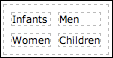 Cell Spacing Value 7
Alignment
The alignment setting impacts where the table will be located on the page, not where the contents are located inside the table. Cell padding, Row, and Column properties change the way content is displayed inside the cell.
- Not Set - The table will default to the left side of the page.
- Center alignment – Click center to align the table in the center of the page.
- Right alignment – Click right to align the table on the right side of the page.
Borders
The default border setting is 0, meaning no cells walls are visible on the table when you place it on your template. Dashed lines are visible in the Text Editor to make it easier for you to see the cell boundaries when you are designing your template; however they are not visible on your website or email. If you want visible borders, select a border value of 1 or more in the text field.

Border Value 1

Border Value 7
Width and Height (W & H)
When you set the width and height of the table, you ensure a minimum, but not a maximum table size. When width and height are set, the cell walls will continue to expand if needed to meet the demands of the content entered into the cell. If you do not select a width and height the table will appear in the text editor in a collapsed form (no space inside the cell). The cells will expand as you add content to the cell.

Class
Sometimes you want your table cells or columns to have unique characteristics, so you get your web developer to create CSS classes. If you have pre-defined CSS classes developed, they will appear in a drop-down menu beside Class and you can select the one you want.
Table Caption (Header)
If you check the table caption checkbox, a header row will appear at the top of your table that runs the full width of the table. You can use this header row to enter a caption and/or image. Dashed lines show where the header is located when the table border has a value set at 0. When a border value of 1 or more is set, the header is not visible. However, if you begin to type across the top of your table you will see that the header row is present.
Advanced Tab
Id
Selectors let you select elements on a HTML page so they can be styled. An Id selector is used to select styling for a single element. For this reason an Id must be unique. It cannot be used for a second element on the same page. An Id must contain at least one character and it cannot contain any space characters. An example of a table Id may be tbl1.
Summary
The summary attribute is used when the purpose of the table is to display data. It is used to describe how the data has been organized on the table or to provide directions on how to navigate the table. Screen readers read the summary, making the content more accessible for visitors who are visually impaired or unable to display the graphics. Leave the summary blank if the table is simply used to control placement of content.
Style
There are two ways to add style to your table. You can use the individual fields (i.e. width, height, border, background color, etc.) or you can type your specifications into the style text field. (I.e. width: 5px; background-color: #cfc22f; height: 5px; border: 1px solid #289bd7). People used to working with HTML frequently prefer to use the style text field.
Language Code
The language code sets the language for the table content. Search engines and browsers use this feature. You can find language code tables online. Only those language codes that are part of the installed language pack will work. The default language is English (En).
Background Image
To add a background image for your table, type or paste the URL for your image into the text field. For external images be sure to include http://. You can also use the asset picker to insert a background image from the STUDIO into your table.
Frame
The frames attribute specifies which part of the outside border should be visible when a border value of one or more is set. Frames are invisible if the border setting is 0.

not set – outside and inside borders are visible.
void – all outside borders are removed; all inside borders are visible.
above – the top outside border is visible; all inside borders are visible.
below – the bottom outside border is visible; all inside borders are visible.
hsides (horizontal sides) – the top and bottom outside borders are visible; all inside borders are visible.
lhs (left-hand side) – the left outside border is visible; all inside borders are visible.
rhs (right-hand side)- the right outside border is visible; all inside borders are visible.
vsides (vertical sides) – the left and right outside borders are visible.
box, border – all outside and inside borders are visible.
Rules
The rules attribute specifies which borders are visible between the cells when borders (in the general tab) are set at 1 or more pixels. Inside and outside borders are invisible when borders are set at 0.

not set – when the rules attribute is not set inside and outside borders are visible.
none – no lines are visible inside the table; outside borders are visible.
rows – lines are visible between the rows; outside borders are visible.
columns- lines are visible between columns; outside borders are visible.
all- places lines between all the cells in a table.
Language Direction
The default setting is left to right, however right to left can be selected from the drop-down menu.
Border Color
Border color only works if you specify a border size of 1 pixel or more in the general tab. Click on the color icon and you can select a color from one of the three tabs by clicking on the desired color.
Background Color
Use background color to specify the color that will fill your table cells. Click the color icon and select a color from one of the three tabs by clicking on the desired color.
Table Row Properties
Sometimes you want different rows in a table to have distinct characteristics. For example a table head is usually styled differently than the body or footer rows. Unique styles are applied using the tools in Table Row Properties.
Place your curser in the row you want to select properties for (color, size, etc). You can apply the property values to single or multiple rows.
Click the Table Row Properties icon to open the dialogue box (see figure below)
Place your cursor in the row that you want to select property values for.

Row in table part
Select the type of row you want to style from the drop-down menu, Table Head, Table Body or Table Foot. Table Head refers to the top row inside the table not to the Header that spans the top of the table.
Alignment
Select how you want the content aligned inside the cell(s): center, left, or right. The default setting for data cells is left, but center for the header.
Vertical alignment
Select whether you want the content aligned with the top of the cell, centered in the cell or aligned with the bottom of the cell.
Class
No set - uses the default style for content. CSS classes are used to define specific style options for some of the elements on your website (i.e. sidebar, etc). If you have asked your web developer to develop pre-defined CSS classes, they will appear in the drop down menu and you can select one.
Height
Enter the number of pixels you want for the height of the cell. This defines a minimum height. The cell will expand if needed to accommodate the content.
Update Current Row
You can apply the style changes that you have selected to the current row, odd rows, even rows or all rows, using the drop-down menu. The text editor defaults to the current row. Note: Make sure the selection you made for the ‘Row in Table Part’ matches where you placed your cursor. If you update using the default setting ‘Update Current Row’, the row in which your cursor is placed will be updated if there is a discrepancy between the two. (I.e. if you select table head and your curser is in the table body, update current row will apply the style values to the table body).
Update
Click update to save changes or cancel to discard changes. Remember that update, saves the changes on the table, but does not save the changes in your document. Before you close your document, CLICK SAVE!
Advanced Tab
ID, Style, Language Direction, Language Code, Background Image and Background Color have been covered under the Advanced tab in Insert and Modify Table. Be sure to select which row you want to apply the changes to from the drop down menu and click Update to save all the changes on the table and Save to save all the changes on your document.
Table Cell Properties
Sometimes it is not enough to be able to set the properties for a specific row; sometimes you require an individual cell or column to have unique characteristics.
- Place your cursor inside the cell that you want to apply properties to.
- Click the Table cell properties icon to open the dialogue box, see the figure below.

General Tab
Tables are essentially viewed as rows even though they also contain columns. You can apply property values to individual cells, entire rows or to an entire table. However when you want to style an entire column you need to do it one cell at a time or have your web developer create style sheets.
Alignment
Alignment, in table cell properties, refers to the alignment of the content inside the cell. Use the drop down menu to select the horizontal alignment of the content in the cell(s) – cell, center, left or right.
Vertical Alignment
Use the drop down menu to select the vertical alignment of the content inside the cell(s) – top, center or bottom.
Cell type
Use the drop-down menu to select if you want the properties applied to the data cells or header cell. Tables that contain tabular data generally have their data organized under table heads. In figure 9-4 the shaded cells are header cells. The white cells are data cells.
Scope
The scope attribute identifies whether a cell is a header for a column, row or group of rows. Screen readers can use the scope attribute. In the figure below the scope of the header cells saying Men, Women and Children is ‘column group’, because each header cell spans multiple columns. The scope of the True/False header cells is a ‘column’. The Scope of the Question header cells is row. Select a scope for your header cells from the drop-down menu.

Width and Height
The pixel values you choose for width and height set a minimum width and height for the cell in which the curser is placed. The cells will expand to meet the demands of the content.
Update current cell/Update all cells in a row/Update all cells in the table
You can select which cells the properties are applied to by making the appropriate selection from the drop-down menu.
Insert/Delete Table Cells
Insert /Delete Table Rows 
Insert/Delete Table Columns

The above icons let you insert and delete table rows and columns. Listed in the order in which they appear.
- Insert a row above the row in which the curser is placed.
- Insert a row below the row in which the curser is placed.
- Delete the row in which the curser is placed.
- Insert a column to the left of the column in which the curser is placed.
- Insert a column to the right of the column in which the courser is placed.
- Delete the column in which the curser is placed.
Splitting and Merging Table Cells

Lets you split table cells that have previously been merged back to their original state. The split icon has no effect on cells that have never been merged.

Lets you merge cells two or more adjoining cells into one larger cell. To merge cells, place your curser inside the cell that you want to merge. Click the merge icon. Enter the number of cells in a row or column (or both) that you want to merge. Cells in a row will merge with cells to the right of the cursor and cells in a column will merge with cells below the cell in which the cursor is placed. The figures below provide examples of merged cells with the number of merged rows and columns explained below.

1, 2, 3: Cols 2, Rows 1 – Cells 1,2, &3 span 2 columns each, but only 1 row.
4: Cols 1, Rows 2 –Cell 4 spans 1 column and 2 rows.
5: Cols 2, Rows 2 – Cell 5 spans 2 columns and 2 rows.
6: Cols 3, Rows 2 – Cell 6 spans 3 columns and 2 rows.
7: Cols 6, Rows 4 – Cell 7 spans 6 columns and 4 rows.
Click Update so all the changes are saved on your table. Click Save at the bottom of your document so all the changes are saved in your template.

Full Screen

It is often easier to work with tables if you have a larger workspace. Click the full screen icon and the work area will fill the entire screen with a toolbar across the top.
Newsletters Mail-out
Provided you have built templates for your newsletter mail-out you can select a template and add a newsletter.
- Click Communications from the navigation bar.
- Click the tab Newsletters from the left sidebar. The list of template titles are displayed in the sidebar.
- Click on a template from the sidebar. This opens a second column where all the existing newsletters made from this template are organized by the date they were Saved
- Click the +symbol next to Newsletters from the second column to open a Add Newsletter (Template: template name) page divided into three sections
The top section of Add Newsletter contains fields to describe the sender, the subject and tags associated with the Newsletter
From Name – The first and last name of the logged in user
Email – The email address of the logged in user
Subject – The subject line of the mail-out of the newsletter
Recommended Tags – The marketing tags that have been defined for the account
Tags – These are custom tags that can be selected or added to the newsletter

The middle section called Text contains the content from the selected Template. See the section above on templates and the chapters on Editing Text and Media for more details on editing or creating the content of the newsletter.
The bottom section called Choose Recipients, allows you to select the Contacts to receive the Newsletter. To draw up a list of recipients to send your email marketing campaign to, you need to display a list of contacts in the second column, where you can place a check in the box beside each recipient you wish to send the email to. You have four options for displaying contact lists:
Option 1: Click Recent to display the list of contacts you have recently worked with in LOOKBOOKSpro.
Option 2: Click A-Z or Z-A for an alphabetical listing of contacts.
Option 3: Click By Company A-Z or Z-A for a list of contacts organized by company.
Option 4: Click a group for a list of contacts in that specific group. Use the scroll bar to see the complete list of groups.

Save, Cancel, Send Preview Message and Send
At the bottom of the Newsletter page are action buttons for the newsletter
Save – Saves the Newsletter without sending it as an email
Cancel – Aborts the newsletter and returns a blank newsletter page
Send Preview Message – Sends an email only to the user email address to Preview the contents of the Newsletter mail-out.
Send – Emails the Newsletter to the recipient list. Once have been sent, the response data stats will update as the emails are sent, received, opens and clicked upon.
Chapter 7: Website
The Website page is divided into two separate pages accessible from the sidebar choice of News or Pages.
News
You can use the LOOKBOOKSpro News page to create professional quality news posts. Awards, charity events, trade shows and fashion trends can be published to your website using the tools in News. Categories and tags link your posts to multiple pages that are dynamically assembled when visitors click linked text or images.News posts can be sorted by date, alphabetically by title or according to their publication status.
Topics covered in News include:
- Creating News Posts
- Section 1: Add News Item – Title, Category, Location, Publish, Tags
- Section 2: Text
- Section 3: Associations
- Sort News Posts
Creating News Posts
- Click NEWS on the navigation bar.
- Click the + symbol beside NEWS on the sidebar.
- Complete the three sections in the content area: 1. Add News Item, 2.Text and 3. Associations. Use the scroll bar to locate all the sections and the Save button.
Section 1: ADD NEWS ITEM
Title
Type the title of the news article into the title field. Select titles carefully; titles are used by search engines and your website visitors.
Category
Categories are general words or brief phrases used to organize news posts (i.e. Men’s Fashion, Cosmetics). Choose a category from the drop-down menu. If the category you are looking for is not available, you can access the ‘Add a New Category’ tool by clicking on CATEGORIES, in the sidebar. You can also add, edit, delete and undelete News Categories in Admin. (See chapter 13: Admin)
Add New Categories In NEWS
- Click the Categories drop-down menu in the sidebar.
- Click Add New Category.
- Complete the Name field in the Create New Category dialogue box.
- Click Create to save and Cancel to discard.
Location
Add city, state/province etc, Country.
Longitude & Latitude
This field can be left blank. It usually fills automatically when the address field is completed.
Publish
News items ready for publication can be published to the website immediately by making sure the box beside Published is checked. The default setting is PUBLISHED. Published news posts have a check mark beside them in the sidebar.
Published On: You can publish the news post immediately or delay publication by changing the publication date using the drop down menus.
Do not publish – To save a news item that you do not want to publish until further notice, click the box beside Publish to turn it off. The check mark will be removed.
Tags
Tags are brief, specific words or phrases used to help identify your news post. Type a word or phrase into the text field and press the enter/return key. Each tag must be entered separately to function properly.
Section 2: TEXT
Use the text editor to compose your news post. The tools in the text editor are standard and probably familiar. For more information on text editing tools see Chapter 10: Text Editing and Chapter 11: Media.
Section 3: ASSOCIATIONS
Use Associations to make connections between the news item and the clients affiliated with the story. To select the clients, you need to display a list of clients in the second column and then check the boxes beside each client associated with the news post. To display lists of clients in the second column you have three options.
Option 1: Click Recent to display clients recently worked with LOOKBOOKSpro.
Option 2: Click A-Z or Z-A to display an alphabetical listing of clients.
Option 3: Click the Client Type (i.e. Photographer) to display all clients organized under that type.
Click Save to add the content or Cancel to discard
Sort News Posts
Several options are available to sort your news posts to simplify your search. Click the arrow beside sort in the sidebar to view the drop-down menu.

- Click Recent to sort posts by date.
- Click A-Z to sort posts by title in alphabetical order.
- Click Publish or Un-Publish to sort posts by publication status.
Pages
Pages, in LOOKBOOKSpro function much like the pages in a magazine in that they are composed of an entire page of text and media (graphics, photos, videos etc.) in a carefully defined layout. This is in contrast to the pages in News that are composed of chunks of information, dynamically created in response to clicking on a category or tag. The type of content that is selected for pages is information that rarely changes and that you want to have displayed on one page only (i.e. background information about your site).
Content that changes rapidly and is applicable to multiple pages should be entered into the News page of LOOKBOOKSpro.
Topics covered in Pages include:
- Add New Pages to Your Website
- Section 1: Add Page – Page Name, Publishing Status, Tags
- Section 2: Text
- Section 3: Associations
Add New Pages to Your Website
- Click PAGES on the navigation bar.
- Click the + symbol beside PAGES in the sidebar.
- Complete the three sections in the content area: 1. Add Page, 2. Text and 3. Associations. Use the scroll bar on the right to locate all the available sections and the Save button at the bottom of the page.
Section 1: ADD PAGE
Name
Enter the name of the page in the name field. Choose page names carefully; titles are important for visitors looking for specific information and for search engine ratings.
Publishing Status
Publishing status defaults to Published. Click the box beside published if you are not ready to publish the page to your website. You can change the publishing status later by using Edit.
Tags
Tags are brief, specific words or phrases used to help identify key information found on the page. Type a word or phrase into the text field and press the enter/return key. Each tag must be entered separately to function properly. As you enter words or phrases, possible matches sometimes appear in a pop-up window. You can click these tags to enter them into the text field.
Section 2: TEXT
Use the text editor to compose your page. The tools in the text editor are standard and probably familiar. For more information on text editing tools see Chapter 10: Text Editing and Chapter 11: Media
Section 3: ASSOCIATIONS
Use Associations to connect your pages with clients affiliated with the story. To select clients, you need to display a list of clients in the second column and then check the boxes beside each client associated with the page. To display lists of clients in the second column you have three options.
Option 1: Click Recent to display client’s recent work within LOOKBOOKSpro.
Option 2: Click A-Z or Z-A to display an alphabetical listing of clients.
Option 3: Click the Client Type (i.e. Photographer) to display all clients organized under that type.
Click Save to add the content and Cancel to discard.

Chapter 8: Editing Text
You are probably familiar with most of the text editing tools used in LOOKBOOKSpro. Text editing tools can be found on any of the pages where you will be writing documents and/or designing templates. Two rows of text editing tools are available on the Artists, Pages and News pages, while a third row of tools can be found in Newsletters, which can be used for designing templates.
In this chapter, tools used to format characters and paragraphs are covered. In Chapter 11: Media tools pertaining to uploading media and creating links are covered and in Chapter 12 inserting and modifying tables is covered.
Topics covered in this chapter include:
- Visual versus HTML Mode
- Font Styles
- Paragraph Styling
- Creating Lists

Visual Mode versus HTML Mode
The default setting for the text-editing component of LOOKBOOKSpro is the visual mode. Visual mode has the advantage of letting you use the button bar to format your characters, select styles, bullets, columns, etc. rather than having to use HTML code. Visual mode also has the advantage of generally allowing you to see the text as it will be seen on the website after it is published.
If you click HTML on the Button bar you can work in HTML mode. In HTML mode you are able to see the code, and you need to use code to make style and formatting changes, rather the buttons that are available in visual mode. Unless otherwise specified the directions used in this manual are written for user’s working in the visual mode.
Enlarging the Work area
If you want to enlarge the work area, click the small lined triangle in the lower right corner of the text editor and drag it downward. This feature is only available in visual mode. To enlarge the screen for HTML mode, return to Visual mode to resize the work area, and then switch back to HTML mode.
Formatting Characters versus Paragraphs
Whereas font style commands are applied to individual characters, paragraph style commands are applied to a whole paragraph. For example if you want to embolden all the letters in a word you need to highlight the entire word and then click the bold icon. However, if you wish to indent a paragraph, click anywhere in the paragraph and the entire paragraph will indent. You do not need to highlight the entire paragraph. Recognizing this small difference can save you a lot of time and headaches when you are formatting and styling your documents.
Word processing commands treat text that has been separated from other text in a document by using the enter/return key as a paragraph.
Fonts Styling
Bold, Italics, Underline, Strikethrough, Subscript, Superscript

Font styles include bold, italicize, and underline, strikethrough, subscript and superscript. To apply any of these formats, highlight all the characters that you wish to apply the formatting to and click the pertinent icon. When text has been formatted, the pertinent icons remain lit. To return the characters to normal, highlight the characters that you wish to change and click the icon(s) that you want to turn off. (Remove formatting and Redo/Undo is covered below)
Family

Highlight the text that you want to apply a different font. Click the arrow to select a font family from the drop-down menu.
Font Size

Highlight the text that you want to apply a font size. Click the arrow to select a font size from the drop-down menu.
Highlighter
Click and drag the mouse over the text you want to apply highlighter. Click the arrow beside the highlighter icon to select a color. To remove the highlighter from the text, select the color white from the bottom right corner of the color chart.
Color Text

Highlight the text that you wish to display in colored font. Click the arrow beside the color text icon to select a color from the color chart.
Remove Formatting

The remove formatting icon works more predictably if you highlight the area that you wish to remove the formatting from and then click the icon. The remove- formatting icon removes font styles (i.e. font family, font size, bold, underline, etc.) but it does not remove paragraph styles (i.e. headers, indents, alignment, superscript, subscript, etc.)
Undo & Redo

Undo (left curved arrow) and Redo (right curved arrow)
With the Undo and Redo icons, you can delete or restore the last ten actions.
Paragraph Styling
Formatting paragraphs works differently from character (font) formatting; if you place the curser anywhere in a paragraph and click a paragraph-formatting button (Formatting Menu, Remove Formatting, Indent, Out dent, Alignment, etc.) changes will be made to the entire paragraph. You do not need to highlight the entire paragraph, although it is okay to do so. All text separated from other text by the enter/return key is treated as one paragraph.
Note: Paragraph formatting is not erased when you use the Format Erase icon to clear formatting.
Format Menu

The Formatting Menu is a drop down menu similar to the Style or Font Family menu bar. It is located between the Styles and Font Family buttons. However, it differs from the rest because the title that appears on the button bar is the title of the menu item that was last used i.e. it may say Format, Paragraph, and Heading 1 etc. The Format Menu is primarily used to select a heading and subheading formats or formatting for the body of your document. It can also be used to select a format for addresses or a preformatted style.
Alignment

Text Editor defaults to a left alignment. Alignment buttons apply to text and images. Click anywhere in the paragraph or on the image that you wish to align and select the type of alignment you want to apply (left, center, right or justified). To return to left alignment, click the highlighted alignment button to turn it off, or click the left alignment button.
Note: Justified text is aligned on the left and right side of the page. To do this, the Text Editor adds more spaces between words. Some people find justified text more difficult to read.
Indent – Out-dent

Indent (move paragraph right) or Out-dent (move paragraph left)
Click anywhere in the paragraph that you wish to indent or out-dent. Click the icon that has the arrow pointing in the direction that you wish to move the paragraph. Click the same button a second time and the paragraph moves further in the same direction. This is unlike other Text Editing buttons that are turned off when clicked a second time.
Note: You cannot indent the first line of a paragraph by using the indent button because the whole paragraph moves. Press the tab key on your keyboard to indent the first line of a paragraph.
Block quote

The block quote is used to indicate a quote from a large section of text from another source. Click the paragraph you wish to place in a block quote or highlight the paragraphs you wish to include; click the block quote icon and the paragraph(s) will indent on the right and left margins. Block quotes should only be used for quotes, not as a styling button because of how search engines use block quotes.
Creating Lists (Bullets and Numbering)

Lists help break information into manageable pieces. You can organize your lists in an unordered form using bullets that are circles, squares or discs or in an ordered form using different types of numbers or letters. Two options are available for creating bulleted lists:
Option 1
- Click the bullet icon to reveal the drop-down menu.
- Select a bullet style.
- Enter the text for your listed items. Press the enter/return key after each item.
Option 2
- If you have already entered the text and have decided you want to present the information as a list. Separate each item from the remaining text by pressing the enter/return key.
- Highlight all the items you want in the list.
- Click the bullet or numerical list icon to reveal the drop down menu.
- Click the style of the bullet that you want.
Note: If you click a list button while your curser is in a paragraph or at the end of the paragraph the entire paragraph will become the first item on a list. To erase the bullet click the same list button (while the curser is in the text) and it will turn off.
Cut, Copy, Paste, Paste as Plain Text, Paste from Word

The cut, copy, paste, paste as plain text (formatting removed) and paste from word are not currently supported by LOOKBOOKSpro but can be activated by using shortcut keys. Highlight the item that you want to cut, copy or paste and use the pertinent shortcut keys.
If you have ever copied and pasted content from a Word document or Website into a document for publication on your website, you have likely discovered that the content does not appear on your website with the same formatting that you expected. This is because copied text frequently contains coding that can wreak havoc with your website formatting. One way to ensure you are copying plain text that will not interfere with your website formatting is to first copy and paste the text into a plain text document such as Windows Notepad or MacTextEdit; click format and select plain text. All the formatting will be removed from the text and you can then copy and paste the content into your document.

Chapter 9: Media
LOOKBOOKSpro contains powerful, easy to use tools for uploading and inserting media into your client profiles, posts, pages and newsletters. Media includes images, videos, audio, and documents. (For more information on uploading images to Studio, see Chapter 5: Studio)
This chapter is divided into three sections:
- Asset Picker – lets you add media to your documents from Studio.
- Insert/Edit Images – lets you insert and edit media into documents from your computer, online and Studio.
- Insert/Edit Embedded Media – lets you insert and edit videos into documents from your computer, online and Studio.
Topics covered in this chapter include:
- Add media to documents from Studio
- Short and long descriptive text used by text readers
- Creating margins around your images
- Select framing width for images
- Place text around images
- Swap Images
- Image Maps
Asset Picker (Selecting Images from the Studio)

Asset Picker Icon
The Asset Picker Icon is located on the text editor in Clients, News, Pages and Newsletters. It lets you select and insert images from the Studio into documents. Images can be added to a document individually or in batches, from unassigned assets (assets loaded into studio for general use) or from portfolios, in thumbnail or large size. If you want to define more of the image characteristics that you import from studio, you can do so by clicking on the image after it has been inserted into your document, and then click the Insert/Edit Image Icon (tree), covered a little later in this chapter.
- Open the document you wish to add images to and place the curser where you want to place the image.
- Click the Asset Picker icon. Unassigned assets appear in the workbench (lower pane) by default. If you wish to place a portfolio in the workbench, click the category the artist is organized under >click the artist name > click the name of the portfolio you want to select images from.
Search for an image in the workbench - There are two options for searching for an image in the workbench
Scroll through the images.
- Type an identifying word or phrase into the Search All Assets field and click Search by Keyword (words/phrases contained in the image title) or Search by Tag (words or phrases added to the image for search purposes).
- Click on each of the images you want to insert. Then select Insert Large Image or Insert Thumbnail Image.
- Be sure to scroll to the bottom of the document and click save, before you leave the document.
De-select Images (Before They Are Inserted Into a Document)
If you want to discard an image that you selected before inserting it into your document, click the image a second time and it will de-select. If you want to de-select all the images that you have selected click Clear Selection.
Remove Images from a Document
To delete an image that has been inserted into a document, click the image in the document. Press the delete key.
Insert/Edit Image

Click the Insert/Edit Image icon to open the dialogue box shown in the figure below. The dialogue box has three sections: General, Appearance and Advanced.

General Tab
The default setting for the insert/edit image dialogue box is the General tab.
Image URL
Type, or copy and paste the URL for the image into the URL field.
Image Description
The image description becomes the alt attribute for the image, meaning the text describing the image becomes visible when the user cannot display the image. This feature is important for people who use text readers. When the image description is left blank an empty icon will appear when an image cannot be displayed. Search engines use image descriptions.
Title
The image title can be used as an optional caption; it becomes the title attribute in HTML. Keep it relevant, short, catchy and concise. The image title appears when you mouse over the image.
Preview
Click preview and the image will appear on the screen in the dialogue box.
Insert
You can click insert and the image will appear in your document. However, first you may want to make choices regarding image size, location and how and where text is placed around your image. To make these style choices click the Appearance tab.

Appearance Tab
In the appearance portion of the dialogue box (figure 11-2), you can see an image of a tree with text surrounding it. This image and its text are provided to give you a quick preview of the impact of the choices you make. When you work with alignments these changes are visible immediately; however when you make changes to spaces, borders and styles, you need to click on the image to preview the changes.
Alignment
When you align an object you always align it with something. To understand how the alignment choices will affect the placement of your image in a document you need to bear in mind what the image is being aligned with. In the figure below, one large image and 5 smaller images have been placed on a single line and yet they appear as though they have been placed on multiple lines. Notice, however that all the words follow a single line. Explanations are provided below for the location of each image.
First you must place your cursor where you want to place your image.

Not set, Baseline - If you do not set the alignment for your picture it will default to the Baseline setting. The baseline is an imaginary line upon which all letters sit. When you select baseline, the bottom of the image will align with the bottom of the text.
Top - The top of the image is aligned with the top of the tallest element on the line. (In figure 11-3 the tallest element is the first picture – a large character would have the same effect).
Middle - The middle of the image is aligned with the text surrounding it.
Bottom - The bottom of the image is aligned with the bottom of the lowest element on the line.
Text Top - The top of the image is aligned with the top of the characters in a line.
Text Bottom – The bottom of the image is aligned with the bottom of the characters on the line.
In the baseline, top, middle, bottom, text top and text bottom alignments, the image behaves like a large character, in that it moves along the line when you type text before the image and only one line of text can appear beside the image.
Left & Right – The left and right alignment place the image along the left or right margins of the document. The image will float down if text is added before the image, but the image does not move along inside the line. Text wraps along the side the image.
Dimensions
Set the dimensions of the width and height for the image in pixels. The field on the left is the width and the field on the right is the height.
Constrain Properties
Tick the Constrain Properties box to retain the proportions of your image. When constrain properties is ticked, if you select the width for your picture, the computer will calculate the appropriate height when it inserts the picture, or if you select the height, the computer will calculate the width. The computer calculated dimension is not immediately visible in the field, but can be viewed after you insert the image by clicking the insert/edit icon.
Vertical Space
Vertical space keeps text from crowding the top or bottom of your image. Enter the number of pixels in the vertical space field to select the height for a margin above and below the image. No text will appear in this margin. However text may appear beside this empty space, depending on the choice you make in alignment. Click the image in the dialogue box to preview the impact of the vertical space you selected.
Horizontal Space
Horizontal space keeps text from crowding the side of the image and it can be used to create space between images. Enter the number of pixels in the horizontal space field to select the margin width. Remember this margin width will also impact how close the image can be placed to the left or right page margins (depending on the alignment choice you have selected). Click the image in the dialogue box to preview the impact of the horizontal space you selected.
Border
The default setting has no border around the picture. Enter 1 or more to add or increase the size of the border outlining your picture. Click the image in the dialogue box to preview the impact of your selection.
Style
Codes are automatically entered into the Style field as you complete the individual fields in the dialogue box. If you prefer working in code, you can bypass the individual fields and enter the code directly into the Style field.
Insert
You can insert the image at this point or you may want to look at the advanced tab (figure 11-4) to define a few more characteristics.

Advanced Tab
Swap Image
You can display multiple images in one location on your page. These images will change from one to another in response to the visitor placing the cursor over the image.
Alternative image
If you wish to use the alternative image function, check the checkbox to activate this option.
For mouse over
To select an image that will appear when a visitor passes their mouse (or cursor) over the original image, enter the URL for the second image into the text field.
For Mouse out
To select an image that will appear when a visitor passes their mouse (or cursor) off or away from the original image (or the mouse over image), enter the URL for the second image into the text field. Note: You may choose to re-select your original image as the mouse out image. When this is done, the original image is visible when the page loads, the alternative image becomes visible when the visitor passes their mouse/curser over the original image, and the original image returns when they pass their mouse/curser away from the area of the image.
Miscellaneous
The areas under miscellaneous require some knowledge of HTML and CSS. Most HTML and CSS code is beyond the scope of this user’s guide. However there are excellent books available and tutorials on the web to guide users who wish to further define their images using these more advanced options.
Id
The Id attribute uniquely identifies an element in your document/page that you have selected specific styling for (in this case an image that has been inserted). Two elements in the same document cannot use the same Id. The Id must be at least one character in length and have no spaces. An example of an image Id may be ‘Image1’.
Language Direction
The default setting is left to right, however right to left can be selected.
Language Code
The language code sets the language for the table content. Search engines and browsers use this feature. You can find language code tables online. Only those language codes that are part of the installed language pack will work. The default language is English (En).
Image Map
Image maps specify hotspots on your image that you can click on to achieve a specific response. (I.e. A map of the USA may have a hotspot located under each state that when clicked opens a webpage with information on the state). Hotspots may be circles, squares or polygons. The above example shows how Image maps can be used to reduce the need for multiple text links.
Some important considerations when using image maps are
Make sure the image is suitable
Colorful photographic images display better as JPEGs
Line and text images work well as GIFs
Keep the image file size as small as possible for faster loading
Other considerations include:
Shape - Determine the shape of the hotspot. The greater the number of sides on the hotspot, the greater the number of coordinates you will need to enter.
Coordinates - Coordinates are used to specify the exact location of the hotspots within the image. Coordinates refer to the specific pixel in your picture. The X coordinate is the number of pixels across, starting from the left edge of the picture. The Y coordinate is the number of pixels down from the top edge of the image. When you change the image size for a mapped image, you may have to change the coordinates.
Squares and rectangles must have two sets of coordinates; the upper left x1,y1 and the lower right x2,y2. (I.e. an image 100 pixels by 150 pixels with a square hotspot (20 pixels by 20 pixels) located in the top left corner of the image would have the following coordinates - x1,y1(0,0) and x2,y2( (20,20).
Circles have three digits - x,y coordinates and r (radius). The x,y coordinates coincide with where the center of the circle is placed on the image.
A polygon (a shape with three or more points) will require a set of coordinates for each corner of the polygon. (I.e. a triangle will have three sets of points, a pentagon 5 set of points etc.)
You can estimate coordinates, calculate them based on the size of the image or use software developed to determine the coordinates.
Specify the Link where the hotspot will direct the user. For more information on links see Chapter 11.
Finally, you need to test the image map on your web browser!
Long Description Link
Writers frequently provide a page with a longer description of an image than the one provided in the Image Description under the General tab. Long descriptions are read by screen readers and are useful for visitors with a visual impairment or who cannot display an image on the screen. The long description link is the URL for the page that contains the description. Long Description Links are hidden and therefore it is not readily apparent to the viewer that a description page is available. It is good practice to include a standard link (which is visible) in addition to a long description link.
Insert/Edit Embedded Media

Open the document that you would like to add media to and place your curser where you want to place the media. Click the insert/Edit Embedded Media icon and the dialogue box shown in Figure 11-5 will open. The dialogue has two sections, General and Advanced.

General Tab
Type
Click the ‘Type’ drop down menu to select the type of media file you want to embed in your document. Options include Flash, QuickTime, Shockwave, Windows media and Real media.
File URL
Type or cut and paste the URL for the media you want to insert into the text field. For external links be sure to include the proper prefix (i.e. http://).
You can use the Asset Picker Icon to insert embedded media that has been uploaded to Studio.
Dimensions
Set the width and height (in pixels) for the size you want the image to display on your website. The field on the left is the width and the field on the right is the height. If you want to make sure the image maintains its proper proportions, check the box beside Constrain Properties before you set the width or the height. Select one dimension and the computer will select the missing dimension.
Preview
Click preview and you can see if the video works properly. If you click Insert, an image similar to the one shown in Figure 11-6 will be displayed on your text editor screen. This lets you to see how well the size of the image works in the document and where you want text to appear. Click save and a functioning video appears on your document. Note: The video does not play in the text editor.

Advanced Tab
The advanced tab lets you select additional options for how your media file will be displayed and/or played on your website. The advanced tab dialogue box is shown in the figure below.

Id
The Id attribute uniquely identifies an element in your document or page (in this case the media file that has been inserted). You cannot use the same Id for two elements on the same page or document. An Id must have at least one letter and no spaces. An example of an Id may be video1.
Name
When a name and Id are used for the same object, people often select the same name for both. You can only do this if the name has not been used for any other element.
Align
When you align an object, you align it with something. To understand alignment you need to be aware of what you are aligning the image with.
Top - The image will align itself with the top of the tallest object on the line on which it is placed. Only one line of text will appear beside the image. The remaining text will appear under the image.
Bottom - The bottom of the image will align itself with the bottom of the line of text on which it is placed. Only one line of text will appear beside the image. The remaining text will appear under the image.
Left or Right - The image will appear by the left or right margin on the page, depending on your selection, and text wraps alongside the image.
Background
Use the color palate to select a background color for your media file. Your selection overrides the background color for the medial file but not the HTML page.
V- Space and H – Space
Set vertical and horizontal margins around your image by entering the number of pixels into the V-Space and H-Space fields. This space will impact how closely the image will come to the page margins and how closely text or other images can be placed beside the media file image.
Flash Options
Flash options apply only to Flash files and impact loading speed, image quality, playback speed, etc.
Quality
This setting allows you to balance image quality with playback and loading speed
High – emphasizes image quality over loading and playback speed
Low – emphasizes speed of loading and playback over image quality
Auto low – emphasizes speed of loading and playback at first with the capability of making adjustments if necessary to improve image.
Auto high – places equal emphasis on quality of image and speed of loading, but have the capability to sacrifice appearance for speed when necessary
Best – has the highest image setting and is therefore the slowest to load and playback.
Scale
This option allows you to select how the application is placed within your browser window.
Show all- makes the entire Flash content visible in the specified area, without distortion while maintaining the original width to height ratio (aspect ratio) of the application. Borders can appear on two sides of the application.
No border - scales the content to fill the specified area without distortion while maintaining the original aspect ratio of the application.
Exact fit – makes the entire flash content fit into a specified area without trying to preserve the aspect ratio. Distortion can occur.
No scale – no scaling option has been set so the entire flash content will be visible as defined in the width x height.
WMode (Windows mode)
You will use this setting to determine whether any flash elements appear in front of or behind other elements on a page.
Window (default setting) - This setting provides the most consistent user experience and is the best setting for playing a movie in its own rectangular window on a web page. It provides the fastest performance. Because the browser determines where other elements will be displayed on the page, a disadvantage of this setting is that when you place objects below or above the flash object, they will not necessarily appear as expected.
Opaque – When you select the opaque value, the shock wave flash file (SWF) is opaque and hides everything behind it on the page. A common complaint you will hear regarding the opaque mode is that it will move elements behind the movie, where they cannot be seen. However, when configured properly the elements (i.e. drop-down menu) can be displayed in front of the movie. When the opaque mode is selected, the content file is layered together with the other HTML elements on the page. Therefore it can be resized and you can select how other elements are displayed around, behind, or on top of it. The opaque option reduces performance compared to the window value.
Transparent - When transparent is selected the SWF background is transparent. This mode allows the background of the HTML page to show through all the transparent portions of the movie. In the transparent mode the content file is layered together with other HTML elements on the page. This option is the least performance friendly and should only be used when it is necessary to view an object behind the movie or when you are viewing an irregularly shaped movie.
S-Align
Aligns the area your flash plays in with respect to the rest of your page.
Auto Play
If you check this box, the flash file will begin to play when a visitor clicks on it.
Loop
If you check this box your flash file will play continuously. If this box is unchecked, the flash file will play once and stop.
Show Menu
If you check this box the media player control menu is displayed below your video. If this box is unchecked the control menu will not be visible.
SW Live Connect
If you check this box it will tell the browser to automatically start Java when loading your flash file to the site. Since starting Java greatly increases the time it takes to start a SWF file, it is best to check this box only when necessary.
Base
This field is usually left blank. You may choose to enter the version of the Flash that your file will use by entering it into the text field. It specifies the base directory or URL used to resolve all relative path statements in the Flash player movie.
FlashVar
Flashvar is a way to pass data (variables) from Hotmail to a flash movie. Variables are entered at the root level. It is good for the user name, file name, id, cookie info, etc. However, it is accessible to the user, so do not include any information that should remain secure. The size limit of a FlashVar file is about 64K.
Chapter 10: Links & Anchors
One of the great advantages of websites is the ability to link from one resource to another. You can link to another website, another page on your own website or another location within the same document. Links have two ends, commonly referred to as anchors, the source anchor and the destination anchor. The source anchor is the hyperlinked text or image that you click on and the destination anchor is where you want to go. Either of these anchors can be text, images or media (i.e. video, audio, etc).
In this chapter you will learn:
- How to insert and edit standard links.
- How to insert links using popup windows.
- How to break links.
- How to insert and edit anchors (links to destinations within your document).
Link & Unlink

The link and unlink icons become visible and functional when text or images are highlighted.
Remove Link
- Highlight the text or image that has a link.
- Click the remove link icon (broken chain).
Create Links
- The link that the visitor will click to go to the destination is often called hypertext. To create the hypertext, highlight the text or image that you want the visitor to click. Hypertext is usually 60 characters or less, often contains text that specifies the destination. (I.e. Men’s Fashion) and is often blue and underlined. You can select different styles for hypertext; however it is important to select styles that visitors readily recognize as hypertext.
- Click the link icon (looks like a chain) to open the Insert/Edit Link dialogue box shown in the figure below. The dialogue box has four tabs, General, Popup, Events and Advanced. Not all of these components need to be completed. However, each component will be covered in this chapter in the order in which they appear

General Tab Insert/Edit Link
Link URL
Type the URL into the text box, or copy the URL from the website browser in the destination page and paste it into the Link URL field. Include http:// at the beginning of the URL if the destination is a website. Tip: If you are creating a link to a destination within the document that you are working on, you can leave this field blank because it will be completed automatically when you select an Anchor from the drop-down menu.
Anchors
When documents are long, sometimes you need to create links to areas within the document. To do this, you need to create an anchor in the spot that you are going to jump to within your document. These are called destination anchors. When a destination anchor is created it is given a title. These titles appear in the drop-down menu beside Anchors. (I.e. I may place the hypertext Anchors at the top of my document, then place an anchor beside the title Anchors in the body of the document, and finally select the title Anchors for the destination).
Create a destination anchor in your document
- Place your curser at the beginning of the text you want to link to or select (click on) the image/video you want to link to.
- Click the anchor icon and a dialogue box will appear.
- Type the name of the anchor destination into the name field.
- Click Insert. A small anchor is visible in your text editor. This anchor is not visible on your website page.
Tip: You can create, as many destination anchors as you wish throughout the text and go back later to create the hypertexts that will link to them.
Target
Click the drop-down menu to select where you want the link to open. Sometimes windows are partitioned into frames and links can be opened into a window or a specified frame in the window. The default setting is open in this window.
Open in this window / frame – Your link (destination) will open in the same window or frame, so your visitors will have to use the back button on their browsers to return to the original page, from which they chose to click the link.
Open in a new window (_blank) – Your link will open in a new window so your visitors will have to close the page (or switch between tabs) to return to the original page, from which they chose to click the link.
Open in a parent window/frame (_parent) – If your site uses frames, the link will open in the parent frame.
Open in a top frame (replaces all frames) (_top) – If your site uses frames, the link will open in the top frame.
Title
Although selecting a title for your link is optional, a well-selected title has several benefits:
- It is read by text readers and benefits those who are unable to view the page.
- The title will appear when you mouse over the link.
- Search Engines use hyperlink titles in their page ranking.
Class
If you have asked your website developer to create pre-defined style sheets, known as CSS classes, for your links, the list of these CSS classes will appear in your drop-down menu so you can select one. CSS classes provide options for the appearance of your links (i.e. color, underlining etc.).
Insert
After you have completed the fields in the dialogue box, click Insert to place the link into your document. Click Save at the bottom of your page, to save the link in your document. Test your link to see if it is functioning properly (Links can be tested on the final document, but not in the text editor). To further refine the appearance of your link, mouse over the link and click the Link icon.
Popup Tab for Insert/Edit Link
Popups are an excellent marketing tool when used responsibly. When a visitor wants more information to complete a transaction, you may not want to take them away from the webpage. Hyperlinks, using popups lets you provide further information, while keeping the page open. Because of the abuse of popups for advertising purposes many visitors have disabled this feature; it is important to provide an alternative URL for these visitors.
To open your link into a popup window click the Popup tab to open the dialogue box shown in the figure below.

Javascript Popup
If you have decided to open your link in a popup check the box beside JavaScript popup.
Popup URL
The popup URL functions the same as a URL for the standard type of hyperlink covered under the General tab. Type the URL into the text field or copy the URL from the website browser in the destination page and paste it into the Popup URL field. Include http:// at the beginning of the URL if the destination is an external website.
Window Name
Naming your window is optional; however text readers read the name and it becomes visible when you mouse over the text link.
Size
Enter the width and height for the size of the popup window.
Position
Select where you want the popup window to be positioned on the screen. Enter the distance in pixels that you would like the popup window to be offset from the left corner of the browser window. The coordinates for the left corner of the browser window are (x,y) = (0,0). The x coordinate determines how far the popup window will appear from the left side of the screen and the y coordinate determines how far the popup window will appear from the top of the screen. If you enter c,c for x,y coordinates, the popup window will be placed in the center of the screen.
Options
Options, lets you determine how your popup window will appear on the screen. If you select all of the options, your popup window will look like a typical browser window. If you do not select any options, your popup window will resemble a typical popup advertisement.
Show location bar – The URL address bar appears on the popup window.
Show menu bar – A standard browser (text) menu bar is displayed on the popup window.
Show toolbars – A standard browser toolbar with graphics is displayed on the popup window.
Show status bar – A standard status bar, typically located at the bottom of the popup window is displayed.
Show scroll bars – Standard scroll bars, typically located at the bottom and on the right side of the popup window are displayed.
Make window resizable - This lets your visitors resize the popup window, a handy feature when they want to view what is behind the window without closing it.
Select dependent (Works in Mozilla FireFox only) – If you select dependent the popup window will close when the visitor leaves your site. Otherwise it will remain open.
Insert ‘return false’ - This option is checked by default. It turns off a default action when a popup is selected. (I.e. if you have completed the general tab and have decided to use a popup, you do not need to delete the information in the general tab, it will be turned off if the Insert ‘return false’ is selected.
Finally, click insert to create a hyperlink using a popup window. Click Save at the bottom of your page so the hyperlink is saved after you close the document. Test the hyperlink on the saved document. The hyperlink will not function in the text editor.
Events Tab
To use the events tab you need to have some knowledge of JavaScript code. Otherwise, you should leave this tab blank.
Onfocus - specify the action to take when you focus on the element with a mouse or navigation tab.
Onblur - specify the action when you no longer focus on the element with a mouse or navigation tab.
Unclick- specify the action when you click on the element.
Ondblclick - specify the action when you double click on the element.
Onmousedown - specify an action when you press the mouse pointer on the element.
Onmouseup - specify an action when you release the mouse pointer from the element.
Onmouseover - specify the action when you mouse over the element.
Onmousemove - specify the action when the mouse pointer is moved while still on the element.
Onmouseout - specify the action when the mouse pointer is removed from the element.
Onkeypress - specify the action when a key is pressed and released while on the element.
Onkeydown - specify the action when the key is pressed over the element.
Onkeyup - specify the action when a key previously pressed over the element is released.
Advanced Tab for Insert/Edit Links
Completing fields in the Advanced Tabs is optional. This tab requires some understanding of HTML and CSS. The dialogue box for the advanced tab is shown below.

Id
The Id attribute identifies a single element that you want to style, in this case a specific hyperlink. An Id must be unique. It cannot be used on another element on the page. The Id must be at least one character and cannot have spaces (I.e. hyperlink1).
Style
The style field is completed automatically as you complete the text fields pertaining to style. If you prefer, you can enter the HTML code into the style field, rather than complete the individual text fields.
Classes
Sometimes you want to assign different styles to identical elements that occur in various places (I.e. all sidebar links one color and all content links another color). Classes let you do this. If your web developer has developed different class style sheets, they will appear in a drop down menu, and you can select the classes that you want to apply to your hyperlink.
Target name
The target name specifies where to open hyperlinks (destination). The major browsers do not currently support target names.
Language direction
The default setting is left to right.
Target language
The language code of the target (destination) URL.
Language Code
This attribute specifies the language code for the element. The default setting is “En” (English).
Target character encoding
Unicode is a character set supported across many commonly used software applications and operating systems. Applications that support Unicode are often capable of displaying multiple languages and scripts within the same document. This is a valuable feature in a multilingual business setting. The most recent Unicode is UTF 6. Over half the world’s Web Pages continue to use UTF 8.
Target MIME type
Multipurpose Internet Mail Extensions – MIMEs extend the format of email to support text in different types of character sets, non-text attachments, multi-part message bodies and header information. Examples include: audio/basic; text/html; image/png; image/gif; video/mpeg; text/css;
Relationship page to target
Relationship between the current page and the target URL
Relationship target to page
Relationship between the target URL and the current page.
Tabindex
The default setting for the tab index is 0. The tab index specifies the order in which elements will be focused on when the visitor presses the tab key. (I.e. if a visitor is filling out a form, with a tabindex 0, each time the visitor presses the tab key the curser will move to the next element in the order in which it appears on the page. The tabindex lets you select alternate orders for completing the form).
Accesskey
Accesskeys are keyboard shortcuts that let you go to different areas in a site. They generally consist of a key being pressed at the same time as a specific character. They are helpful for people who do not have a mouse pointer. (I.e. PC users may press Alt 1 to go to a home page or Alt 1 enter/return. Mac users may press Ctrl 1 to go to a home page).
Remove an anchor
To remove an anchor from an area, click the anchor beside the text you are linking to in the document; then click the Unlink icon (broken chain).
Chapter 11: Admin
The Admin area in LOOKBOOKSpro houses tools to effectively manage (add, edit, delete, restore, merge, etc.) content from each of the pages in LOOKBOOKSpro.
Topics covered in this chapter include:
- Add, Edit, Delete, and Un-delete Client types, Groups, Contact Prefixes & News Links.
- Merge duplicate artist managers and duplicate contact managers.
- Import contacts from a CSV file, Excel (XLS) file or VCard; View existing import list.
- Add, Edit, Delete, and Un-delete and provide further details for Company profiles (Companies can also be added in Contacts).
- Add, Edit, Delete, Un-delete News Categories (News categories can also be added in News).
- Change program settings (workbench size, spacing between images, site name and URL, etc.).
- Edit country list for address drop-down menu.
- Restore (un-delete) deleted items - (Containers, Contents, Companies, Groups, Assets, Clients, Contacts, Campaigns, Newsletters, News Items and Pages).
- Log Viewer- view all activities carried out in LOOKBOOKSpro.
CONTACTS
Groups
Contacts can be organized into groups. Group names can be added, edited or deleted in Admin. Placing contacts in groups maximizes efficiency for selecting recipient lists for emailing campaigns and/or reviewing campaign data. (For more information on Groups see Chapter 4: CONTACTS, and Chapter 6: CAMPAIGNS)
Add a group
- Click Admin.
- Click Groups.
- Click the + sign beside Groups in the middle column.
- Type the Group Name into the name field. (The comment field is optional).
- Click Save to add and Cancel to discard.
Edit a group
- Click Admin.
- Click Groups.
- Click Edit beside the group you want to edit.
- Make changes and click Save to update and Cancel to discard changes.
Delete or Un-delete a group
- Click Admin.
- Click Groups.
- Click Delete to discard or Un-delete to restore.
Client Types
Companies generally provide services for a number of different types of clients, i.e. photographers, stylists, models, etc. Client profiles can be categorized by type. A list of Client Types appears in a drop down menu on the Clients page when you are adding or editing a client profile. You can add, edit, delete or un-delete Client Types in Admin.
Add a Client Type
Client types can be added in Admin and on the Clients page. However, additional comments can be added to the Client Type in Admin.
- Click Admin.
- Click Client Types.
- Click the + sign beside Client Types in the middle column to open the dialogue box.
- Type the Client Type Name into the text field (The comment field is optional).
- Click Save to add and Cancel to discard.
Edit a Client Type
- Click Admin.
- Click Client Types.
- Click Edit beside the Client Type you want to edit.
- Make changes and click Save to update and Cancel to discard changes.
Delete or Un-Delete a Client Type
- Click Admin.
- Click Client Types and select the client type from the middle column.
- Click Delete to discard or Un-Delete to restore.
Prefix
Prefixes (Mr. Mrs. Miss, Ms., Dr. etc.) are frequently used as part of a client’s or contact’s identification. They appear in a drop down menu when you are adding or editing a client or contact in the Clients and Contacts pages. Prefixes are added, edited, deleted and un-deleted in Admin.
Add a Prefix
- Click Admin.
- Click Contact Prefixes.
- Click the + symbol beside Contact Prefixes in the middle column to open the dialogue box.
- Type the Prefix into the text field.
- Click Save to add and Cancel to discard.
Edit a Prefix
- Click Admin.
- Click Contact Prefixes.
- Click Edit beside the prefix that you want to edit.
- Type the changes and click Save to update and Cancel to discard changes.
Delete or Un-Delete a Prefix
- Click Admin.
- Click Contact Prefixes.
- Click Delete to discard or Un-Delete to restore the prefix.
Duplicate Artist Manager
You may find a artist profile has been entered into the system multiple times and you want to merge the files. Examine the information in each profile to make sure you retain the most up-to-date information. Notes from all the merged profiles will be merged into the final profile.
Merge Artist Profiles
- Click Admin.
- Click Duplicate Artist Manager.
- Scroll through the client names and check the boxes beside the names of the artists that you want to merge (Instead of scrolling through the names, you can type the names into the name field and then check the boxes).
- In the third column, click the button beside the name you wish to retain.
- Click Merge.
Duplicate Contact Manager
You may find a contact profile has been entered into the system multiple times and you want to merge the files. Examine the information in each profile to make sure you retain the most up-to-date information. Groups and notes from all the files will be carried to the new merged file; however comments do not merge.
Merge Duplicate Contact Profiles
- Click Admin.
- Click Duplicate Contact Manager.
- Scroll through the contact names and check the box beside the names of the contacts that you want to merge (Instead of scrolling through the names, you can type the names into the name field and click the box).
- In the third column, click the button beside the name you wish to retain.
- Click Merge.

CONTACT IMPORT (CSV, XLS & VCards)
If you have contact information stored in another database, you can simply import it into LOOKBOOKSpro. You can import CSV, Excel (XLS) and VCard Files from your computer.
CSV Files
CSV stands for Comma Separated Values, sometimes called comma delimited because of the format it uses to store spreadsheet data or basic database style information. When you want to transfer a large volume of information from a database in one program to another program, you can choose to save the files as a CSV file to make it easy to transfer. To create a CSV File, if you are using a spreadsheet program like Excel, you simply select CSV from the format field, when you are saving your file.
XLS Files
XLS is the default setting for saving spreadsheets created in Microsoft Excel. The X & L come from the word Excel and S stands for spreadsheet.
VCard Files
VCard is the formatting standard used for electronic business cards. VCards are often found at the end of your business email, or on a contact’s website.
New Import
To import a contact from a CSV File, XLS File or VCard:
- Click Admin.
- Click New Import in the sidebar.
- Select the group you would like to organize the new imports under. Organizing your contacts by groups is an efficient way to develop targeted recipient lists for email marketing campaigns. Tip: If the contacts in your list do not all belong to the same group, this field can be left blank and later you can use the edit feature in Contacts to select groups for your contacts on an individual basis.
- Click the Choose File button in the section of Import Contacts area that matches the file type you want to upload (CSV, XLS or VCard). Select the file from your computer and click Choose.
- Click Preview Data. There are two important steps to follow in preview data:
- Examine all the lines on each page to choose which contacts you want to upload and which you want to de-select so they will not upload. By default, all lines are selected for uploading. To de-select a name, click the checked button beside the name to turn it off.
- Check the status of each column. The default setting for each column is Ignore. Information in cells with ignore at the top will not appear in the contact profile. Click the arrows beside each box that says ignore and change it to its proper heading for uploading.
- Click Import All or Import Page – Only those lines that have a check beside them and a heading (other than ignore) on top of each column, will be imported. After the import is completed, you will find a profile for each name that you selected in the Contact page of LOOKBOOKSpro. Tip: If you are working through a long list of imports page by page, you can Click Import Page, instead of Import All. You do not have to import all the pages in one sitting. To complete the remaining pages later:
- Click Existing Imports.
- Click the import that you want to continue working with.
- Click Manage Import Rows.
COMPANIES
Many of your contacts work for a company. Companies are organized by name and type. When you add or edit a contact profile, a drop-down menu appears with a list of company names to choose from. You can add a Company name to the drop down menu in the Contact page. However, to add the company’s contact information, specify the company type and add additional pertinent information to the company profile, you need to go into Admin.
Add a Company
- Click Admin.
- Click Companies in the sidebar.
- Click + beside COMPANIES at the top of the middle column.
- Type the Company Name in the name field.
- Select the company type (to add more company types to the drop-down-menu see Add Company type).
- Complete the information fields and click Save to add and Cancel to discard.
Edit a Company
- Click Admin.
- Click Companies in the sidebar.
- Click Edit beside the Company name you wish to update.
- Make changes and click Save to update and Cancel to discard the changes.
Delete or Un-delete a Company
- Click Admin.
- Click Companies in the sidebar.
- Click Delete to discard a company and Un-delete to restore a company.
Company Types
Companies can be organized by the type of service or merchandise they provide. You can add, edit, delete or un-delete Company Types in Admin.
Add a Company Type
- Click Admin.
- Click Company Types in the sidebar.
- Click + beside COMPANY TYPES in the middle column.
- Enter the name of the Company Type in the name field (The comments field is optional).
- Click Save to add and Cancel to discard.
Edit a Company Type
- Click Admin.
- Click Company Types in the sidebar.
- Click Edit beside the name of the company type that you wish to update.
- Make changes and click Save to update and Cancel to discard changes.
Delete or Un-delete a Company Type
- Click Admin.
- Click Company Types in the sidebar.
- Click Delete to discard or Un-delete to restore the company type.
NEWS
News Categories
Categories are small pieces of information, usually single words or short phrases that are used to organize news items. They can be selected from a drop-down menu on the News page. Categories are usually general terms, whereas tags tend to be more specific. Examples of categories for a clothing company include: Men’s, Women’s, Kids and Babies. Tags may include blouses, sweaters & pants. In LOOKBOOKSpro, categories and tags attached to news items, are used to display dynamic pages on your website. Categories can be added to the drop down menu in the News page or they can be added, edited, deleted or un-deleted in Admin.
Add News Categories
- Click Admin.
- Click News Categories.
- Click the + symbol beside NEWS CATEGORIES in the middle column.
- Type the category name in the text field in the pop-up window.
- Click Save to add and Cancel to Discard.
Edit News Categories
- Click Admin.
- Click News Categories.
- Click Edit beside the category you wish to edit.
- Make changes and click Save to add and Cancel to Discard.
Delete or Un-Delete News Categories
- Click Admin.
- Click News Categories.
- Click Delete to discard or Un-delete to restore the category.
CONFIGURATION
Settings
In settings you can increase or decrease the size of the workbench in Studio and you can change how closely the pictures are placed together. The workbench is the bottom pane. When you decrease the size of your workbench fewer pictures can be displayed on a page, and the number of pages increases to compensate.
Edit Workbench Page Size
The workbench is the bottom pane in Studio where you display media assets (photos, videos, etc.) Altering the workbench size impacts how many images can display on a page (i.e. a setting of 5 will display 5 images, whereas a setting of 20 will allow you to display 20 images).
- Click Admin.
- Click Settings in the sidebar.
- Click Edit beside Workbench Page Size.
- Type the number of images that you want to be able to display on a page.
- Click Save (Click Studio to see if the workbench is the size you need).
Edit Spread Pixel Width
This is where you set the size of the space (in pixels) between images
- Click Admin.
- Click Settings in the sidebar.
- Click Edit (beside Spread Px Width).
- Type the size and click Save. (Click Studio to see if the images are at a satisfactory width apart).
Locations
Countries
In Admin, you can create lists of the countries that you work with on a regular basis. You may also associated states (or provinces) to a country and add cities to each country-state location.
Add a Country Name
- Click Admin.
- Click Countries in the sidebar.
- Click the + symbol beside COUNTRIES in the middle column.
- Type the country name in the name field.
- Type the ISO code into the code field (The ISO Code used in LOOKBOOKSpro is the internationally recognized two letter abbreviation for the country- ISO code lists can be found online).
- Click Save. The newly entered country appears at the bottom of the list of countries.
Edit a Country Name
- Click Admin.
- Click Countries in the sidebar.
- Click Edit, beside the country that you wish to change.
- Make the changes and click Save to update or Cancel to discard changes.
Merge Countries
If you have inadvertently entered a country twice (possibly under different names i.e. England/Great Britain), you can merge the two countries. The country name that will be retained will be the one selected from the drop-down menu in the dialogue box.
- Click Admin.
- Click Countries in the sidebar.
- Click Merge, beside the country that you wish to merge. A dialogue box will open.
- Select the country you wish to merge into from the drop-down menu. The country name in the drop-down menu is the name that will be retained.
Add States/Provinces and Cities
- Click Admin.
- Click Countries in the sidebar.
- A new column called States is displayed to the right of the country
- Click the +symbol beside STATES in the third column.
- Type the State name in the name field
- Type the State abbreviation in the abbreviation field. State or province abbreviations can be found online.
- Click Save. The newly added state appears at the bottom of the list of states for the selected country.
- Cities can be added in the same fashion to a state associated to a country

Localization
Localization is a section in Admin where location specific attributes may be defined, such as the language(s) in common use or currency.
Default Currency
This is a drop down of all currency types that can be selected as the default currency type when entering any currency to an option.

Currency Management
Exchange Rates
Currency management contains an exchange rate conversion for all of the world’s common currencies. It can be updated by clicking the Update button to retrieve the current exchange rates

Tags
Tags section allows you to see the number of associations for any tag, to merge tags, and add or edit tags.

Search tags
A Search tool is available to search by a tag name. Enter a name to the search field and click the search button (magnifying glass icon).
Merge Tags
If one or more tags are duplicated then these tags can be merged together into a tag name of your choosing.
- Click Admin
- Click Tags section
- Search and scroll through the tags and click the checkbox next to a tag you wish to include in the merge. Tag names that are checked will appear in the Selected Tag column below the message “Select the tag to keep (others will be merged into it):”
- In Selected Tags click the radio button on the tag name to keep and click the Merge into selected tag button
Add Tag

- Click Admin
- Click Tags section
- Click the +symbol below the Search field for Tags to open the Edit Tag pane
- Enter a tag name to the Name field and click Save. The tag will be saved
Edit Tag
- Click Admin
- Click Tags section
- Click on a tag name from the list of tags opens the Edit Tag pane
- Edit the tag name and click Save. The tag will be renamed.
Labels
Labels allow for the creation of a color coded indicator for the state of an image/asset in its workflow. For example: New – as an initial state of a new image added or Tagged – when an asset has been tagged. Labels can be selected from the Studio assets menu once configured from this section.
- Adding a Label
- Click Admin
- Click Label section
- Enter a Name for the label and a Tag which will appear on the tag icon
- Choose a Color from the color palette or enter a color code from HTML hexadecimal color codes
- Click Save to save the Label
Developer Tools
There are some tools that are available only to developers or those with higher permissions such as a method to reset user passwords, or to configure some bulk editing tools for associations.
Studio
This section requires special permissions. Based on the UUID of a container that can be obtained from the Inspector tool (see Chapter 5: Studio) you can remove associations in bulk.
User Password Reset
This section requires special permissions. User Password Reset as the name implies, allows a user with permission to reset a user’s password.
- Click Admin
- Click on User Password Reset. This opens the list of current user accounts
- Click on the user name to open the Reset Password pane
- Enter the password to the New Password field and click Reset Password
- A confirmation dialogue will open and by clicking OK the password is reset
Service Types
Service Types are associated to an artist and identify the type of service that an artist can perform. See Chapter 2 on Calendar for more details on Service Type.

Add a Service Type
- Click Admin
- Click Service Types to display the current list of Service Types
- Click the +symbol next to Service Types in the second column. This will add a blank Service Type to the end of the list. Alternatively, click the Add new service type link at the bottom of the list
- Enter a name for the Service Type in the Name field. The new service type is Saved
DELETED ITEMS
A number of deleted items can be found in the Admin page, where they can be restored, by clicking Un-delete. Deleted prefixes and company types can be un-deleted by going into Prefixes and Company Types, rather than from the DELETED ITEMS list.
Deleted Containers
Containers are found in STUDIO. A studio container consists of a category (i.e. photographer), all the individual artists found in that category and the portfolios that display their work. If a category is deleted, all of the artists and their work will be deleted as well. The entire container can be un-deleted in Admin. Click Un-delete to restore the category, artists, and portfolios.
Deleted Contents
Deleted contents are deleted artists and the portfolios that display their works. Click Un-delete to restore the content item.
Deleted Companies
Contacts can be organized by the Company they work with. To restore a company, click Un-delete beside the company name. Deleted companies can be re-entered, rather than being un-deleted.
Deleted Groups
Contacts can be organized into groups. Group names usually represent the contact’s work or interest area– i.e. brand manager). If a group name has been deleted, it cannot be re-entered as a new group; it has to be un-deleted to be used again. If you try to enter a group that is not on the group list and a message pops up on the top of the screen saying Validation Error, Group Name Already Exists, you will find the group name on the deleted group list in Admin. Click un-delete.
Deleted Assets
Deleted Assets refer to images that have been deleted from portfolios and unassigned assets. When you delete an asset it is removed from all of the portfolios that it appears in. It is better to use the Remove Selected feature to remove an image from a portfolio, unless you want to remove it from every album in which it appears. When assets are un-deleted they are not restored to the portfolios; however they do appear in Unassigned Assets (assets for general use).
Deleted Bookings
Deleted Bookings refer to options that have been deleted from the Calendar tab. When you delete a Booking it is removed from the Calendar and the booking is added to the Deleted Bookings section. Bookings can be un-deleted by clicking the un-delete button.
Deleted Artists, Contacts, Newsletters, Pages, Campaigns, News Items
Artists, contacts, newsletters, newsletters templates, pages, campaigns, and news items that have been deleted can all be either re-entered as new items or they can be un-deleted in Admin.
LOG VIEWER
Log viewer provides you with a quick, convenient way to track all the activities taking place in LOOKBOOKSpro. To view the LOOKBOOKSpro Activity Log
Click Admin.
Click Log Viewer in the sidebar.
Click the specific Activity Type